


Latest improvements for IPA
What’s new in the QIAGEN® Ingenuity Pathway Analysis Summer Release (2024)
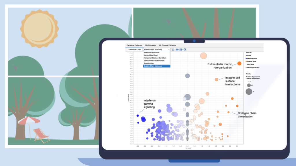
Improve your visualization of Canonical Pathways with the “Bubble Chart (Volcano)” option
Quickly view significant Canonical Pathways in your analyses by plotting the pathways as “z-score vs significance (-log p-value)” in a volcano-style scatter plot. This enables you to create an image export that is ideal for presentation or publication.
Figure 1. View Canonical Pathways with the new Bubble Chart (Volcano) option. Simply click on the drop-down menu in the Canonical Pathways tab in your Core Analysis to easily view pathways as a function of z-scores vs -log p-values. This example was generated from gene expression data collected from TGFβ2-treated equine bone marrow-derived mesenchymal stem cell vs untreated samples (GSE207394). FASTQ files were reprocessed using QIAGEN RNA-Seq Portal. Note: Pathway names were added to this figure using PowerPoint®.
Other software improvements
- Updated several links from Gene View to Land Explorer
- Fixed shapes and coloring for groups and complexes in Path Designer
- Fixed an issue where changing pages in the Molecules tab in Core Analyses could freeze the software
- Fixed an issue involving column titles in exported Comparison Analysis Causal Network heatmaps

What’s new in the QIAGEN® Ingenuity Pathway Analysis Spring Release (2024)
Search and filter Canonical Pathways by name in Comparison Analysis heatmaps
Quickly select a subset of Canonical Pathways for heatmap display by searching for words in the pathway names. This enables you to create the perfect heatmap for image export for presentation or publication.

Figure 1. Search and filter by pathway names in Comparison Analysis. Simply type words from the pathway name(s) to focus the heatmap on pathways of interest.
Content updates
Canonical Pathways updates
New Ingenuity Signaling Pathways
- Cohesin Chromatin Regulation Pathway
- Hematoma Resolution Signaling Pathway
- Histone Modification Signaling Pathway
- Nuclear Cytoskeleton Signaling Pathway
Signaling pathways with Activity Pattern added and content updated
- Cellular Effects of Sildenafil
- Ephrin A Signaling Pathway
- Hereditary Breast Cancer Signaling Pathway
- Parkinson’s Signaling Pathway

Figure 2. Example of a new Canonical Pathway in the release. This figure shows the Hematoma Resolution Signaling Pathway. The pathway nodes are overlaid with colors that indicate their expected activity if the pathway were activated, where red indicates activated and green indicates inhibited. For example, PPARγ is colored red, indicating that this protein would be expected to be activated in case of hematoma resolution (based on the underlying curated literature). In contrast, CD47 (colored green) is an inhibitor of the pathway and, therefore, should be inhibited if the pathway was activated.
>200,000 new findings for a total of >13.3 million
- >79,000 Expert findings (from literature curation)
- >20,900 Protein–protein interaction findings from BioGrid
- >81,000 Cancer mutation findings from ClinVar
- >15,300 Gene-to-disease findings from COSMIC
- >450 Protein–protein interaction findings from IntAct
- >1,700 Drug-to-disease findings from ClinicalTrials.gov
- >700 Target-to-disease findings from ClinicalTrials.gov
- >600 Gene-to-disease findings from the Online Inheritance in Man (OMIM)
- >230 Findings from Clinical Genome Resource (ClinGen)
- >700 Gene Ontology findings
- 50 Newly mappable chemicals
Analysis Match: 54,489 new datasets for a total of 198,636 datasets
Datasets and corresponding analyses will appear in IPA in late April 2024.

The LINCS (Library of Integrated Network-Based Cellular Signatures) datasets and analyses in this release replace the existing LINCS datasets and their analyses. LINCS represents a collection of transcriptional expression data of cells in response to perturbagens. The collection comprises cultured human cell lines treated with bioactive small molecules and genetic perturbation collected with the Broad Institute’s L1000 assay.
The original “fold change” LINCS data have been replaced in favor of replicate-collapsed Z-scores (level 5). The new datasets in IPA are a rationally chosen set of 29,976 comparisons from the total available in OmicSoft. The goal was to select a representative but low redundancy set from those with a relatively strong transcriptional response. The measure of transcriptional activity is represented as “TAS” or “transcriptional activity score”. Specifically, any perturbagen with at least one comparison with a max TAS greater than 0.2 is included. The comparison (dataset) with the greatest max TAS was selected. If there were comparisons with TAS > 0.33, each unique combination of drug x cell line x dose was included, up to a limit of 20 comparisons per perturbagen.
Update to Analysis Match datasets metadata
Users can quickly find which analyses from OmicSoft are new for a specific IPA release. A new metadata field called “OSLandedDate” (short for “OmicSoft Landed Date”) has been added to all OmicSoft datasets in IPA. The values in that field indicate when the datasets were curated and released by OmicSoft. For example, one of the most recent “landed dates” is referred to as 2023R4. As always, all OmicSoft analyses are re-run each quarter, so the date refers to roughly when they first appeared in IPA, not when they were last analyzed.
Removal of overly broad functions
Many broadly defined functions have always been excluded from being scored in a Core Analysis but still appeared in IPA in other contexts, such as when “growing” in networks. For example, IPA included a function called “Cell stage”, which is better described by more specific sub-functions such as “Mitosis”. Such functions were typically too broad to be useful (which is why they were excluded from analysis) and could lead to confusion when present in some areas of IPA but not in analyses. These overly broad functions have now been removed from grow and connect and other “graph” operations in IPA

What’s new in the QIAGEN® Ingenuity Pathway Analysis Winter Release (2023)
New Volcano Plot makes setting up analyses easier and more precise
A new Volcano Plot is available when setting up your core analysis, making it easier to visualize your dataset and set more precise cutoffs for analysis. It enables you to label molecules of interest with their names and export the chart to show the magnitude and significance of your differential expression data in publications and presentations.

Figure 1. Volcano plot in Core Analysis setup. Green dots are down-regulated and red dots are up-regulated genes in this dataset. Gray dots are those that did not pass either the numerical cutoffs, the biological filters, or both.
To make room for the plot, the Core Analysis setup window has been divided into two tabs. The cutoff fields and the plot are on the default main Cutoffs tab, whereas other filters and settings that you have used before have been moved to a second tab called Biological Filters.
Work more efficiently with fast node summary on networks and pathways
Quickly and easily see summary details for a node of interest on a network or pathway with the new node summary panel. For a node of interest, double-click to open the side panel. The panel complements the relationship summary panel that was added in the October 2023 release. Figure 2 shows the panel opened in the context of a Canonical Pathway for the INSR gene.

Figure 2. New node summary in right panel. The left panel shows important details for any node that you click on in the pathway or network.

Figure 3. Canonical Pathway links in side panel. These links open the corresponding pathway in a new window or tab and highlight the node of interest within it, even if it is found in a group or complex and not named specifically on the pathway diagram.
If you click on a pathway node that is embedded in a pathway (Figure 4) , the panel will show a new link called Interaction Network. Clicking this link will open a new “Interaction Network” window and display all the molecular members of that pathway connected to the pathway itself (shown as a node in the center).

Figure 4. Interaction Network links for Canonical Pathway nodes in side panel. All the molecules that are members of that pathway (including those that are members of groups or complexes) are opened in a new Interaction Network window and connected to the pathway node in the center.
Similar functionality is available if you click on a disease or function node in the pathway.
Explore Upstream Regulators and Causal Networks for miRNA datasets
IPA now predicts the activation or inhibition of Upstream Regulators and Causal Networks for expression datasets comprised of mature microRNAs. In the past, microRNAs were excluded as targets for regulators.

Figure 5. Upstream Regulators predicted for mature miRNA dataset. In this example, AGO2 is predicted to be activated, as explained in the next figure.

Figure 6. AGO2 is predicted to be activated. miRNA targets for AGO2 from the dataset are connected to and arranged around it. As indicated in the legend, the direction of differential expression of the targets are consistent with activation of AGO2 except for the one miRNA target shown with the yellow line.
Work more efficiently because folder choices are remembered
Now when you choose any project folder in Ingenuity Pathway Analysis (IPA®) or any folder on your computer to save, copy, upload, move, or export, that choice will persist during your IPA session. The next time that you export or copy, etc. during that session, the location will be remembered, and you won’t need to navigate to or select it again.
Update to Analysis Match datasets metadata
For the Lands that are going to be updated this release (HumanDisease, MouseDisease, and OncoHuman, in January 2024), you can quickly find which analyses from OmicSoft are new for the IPA release. A new metadata field called “oslandeddate” (short for “OmicSoft Landed Date”) has been added to all OmicSoft datasets from these Lands. The values in that field indicate when they were curated and released by OmicSoft. The most recent landed date is referred to as 2023R3 and will appear in IPA in January 2024. In the IPA release of March/April 2024 we will update this field for all Lands comparisons.
Content updates
Explore eight new and two updated pathways
New Ingenuity signaling pathways
- BBSome Signaling Pathway
- Folate Signaling Pathway
- HEY1 Signaling Pathway
- IL-27 Signaling Pathway
- Sleep NREM Signaling Pathway
- Sleep REM Signaling Pathway
- UFMylation Signaling Pathway
- WNT/SHH Axonal Guidance Signaling Pathway
Existing pathways updated to include an activity pattern
- Eicosanoid Signaling Pathway
- Gap Junction Signaling Pathway
Addition of >168,000 new findings (bringing the total in IPA to over 13.1 million)
- >143,000 Expert findings (from literature curation)
- >12,600 protein-protein interaction findings from BioGrid
- >4,700 cancer mutation findings from ClinVar
- >3,900 protein-protein interaction findings from IntAct
- >1,700 drug-to-disease findings from ClinicalTrials.gov
- >1,200 target-to-disease findings from ClinicalTrials.gov
- >600 gene-to-disease findings from the Online Inheritance in Man (OMIM)
- >300 findings from Clinical Genome Resource (ClinGen)
- >100 Gene Ontology findings
- >50 newly mappable chemicals
149,657 expression datasets (2,436 added)
These will appear in IPA in January 2024.


What’s new in the QIAGEN® Ingenuity Pathway Analysis Fall Release (2023)
Reactome’s human pathways are now included in Ingenuity Pathway Analysis (IPA®)
For 20 years, the Reactome organization (reactome.org) has been building an open-source, open access, manually curated, and peer-reviewed pathway database covering many species and topic areas. The group has released their human pathways for download in a format that is compatible with import into QIAGEN IPA. In this release, 502 of these pathways have been fully integrated into IPA.
Figure 1 displays a portion of IPA’s Canonical Pathway library showing the names and categories of a few of the new Reactome Pathways.

Figure 1. Reactome pathways can be found in their own folder in the Libraries section in the IPA Project Manager. A portion of the pathway folder hierarchy is shown.
The Reactome pathways are available in all areas of IPA where Canonical Pathways appear, including Core Analyses, Build and Overlay tools, and Search.
To demonstrate the utility of the new pathways, a Core Analysis was run with an expression dataset derived from Definitive Endoderm cells differentiated from human induced pluripotent stem cells (GSE66282). Figure 2 highlights the scientific value of the Reactome pathways, where the “Formation of definitive endoderm” pathway is the top scoring of all pathways. This type of pathway is expected to overlap significantly with this dataset.

Figure 2. Canonical Pathway bar chart in Core Analysis now includes Reactome pathways. The pathway bars marked with a green dot in the image above are Reactome pathways. The dataset that was curated by OmicSoft from differentiated definitive endoderm cells ratio’ed to the starting hiPSCs (GSE66282). The top scoring pathway for this analysis is “Formation of definitive endoderm” with a B-H-corrected P value of 1.9E-06 and a z score of 3.0.
Several definitive endoderm markers such as SOX17, GSC, and FOXA2 (as described in https://pubmed.ncbi.nlm.nih.gov/22236333) are upregulated as expected, as shown in Figure 3.

Figure 3. Diagram of the “Formation of definitive endoderm” pathway from Reactome as rendered in IPA. Almost all of the genes on the pathway are upregulated in the pathway (https://reactome.org/content/detail/R-HSA-9823730) in the definitive endoderm cells ratio’ed to their starting hiPSCs (GSE66282).
The Reactome pathways include approximately 10,300 genes. Of these, approximately 5,600 genes overlap with our existing Canonical Pathways (which themselves contain 8,700 genes). This means that approximately 4,600 Reactome genes are “new” to our Canonical Pathway collection. Although nearly all “new” genes from Reactome are already associated with existing Diseases and Functions in IPA (and therefore already included in your analysis), the overall effect is to improve IPA’s Canonical Pathway content by enhancing the gene coverage. The total (union) of Canonical Pathway genes is now 13,300 – larger than either source alone.
Try re-running your favorite analyses now to see how the Reactome pathways inform your scientific research. Please ensure that the Reactome checkbox is checked under Sources in the Core Analysis setup when doing so.
See the underlying evidence more easily with new fast relationship viewer
Now, it is faster to see the findings that underpin relationships in pathways and networks. A double-click on a relationship (or “edge”) instantly opens a side panel to show the findings (which have already been pre-fetched), rather than opening a slower pop-up window. Convenient new links in the side panel enable you to click directly through to the specific source of findings. By clicking the expand links in the panel, you can now see all the findings for that relationship without having to load a separate findings page. Lastly, the window clearly lists the number of findings and the number of sources from which they derive, something that was not as clear in prior releases.

Figure 4. New fast relationship viewer sidebar. Not only is it much faster to view the findings, now you can see all the findings in the panel without having to load a separate findings page. Links are now provided to jump directly to the source for any finding.
Save Canonical Pathway settings for an analysis
Any customizations you make to a Canonical Pathway chart in your Core Analysis are now saved with the analysis. This will save you time, especially when you make extensive customizations, for example, to make a figure for a paper.

Figure 5. Save custom Canonical Pathway chart settings. Adjust any of the settings and when you click the Save button, they will be remembered the next time you open that specific analysis. This only applies to analyses you “own” and therefore excludes OmicSoft analyses, for example. Click the “Reset to Default” button to remove your customizations.
New default Canonical Pathway chart and remembering last viewed type
The default Canonical Pathway chart type has been changed to the Horizontal Bar Chart (rather than the vertical orientation). Whenever you first open an analysis, it will now default to the horizontal view.
However, IPA will automatically remember your last viewed Canonical Pathway chart type for any Core analysis that you own (e.g., not for OmicSoft analyses). For example, if you open one of your analyses and switch it to show the Canonical Pathway Bubble Chart and then close it, when you go back to it in the future, it will remember to display the Canonical Pathways as a bubble chart.
Proteomics data in the Land Explorer section on IPA Gene Views
Land Explorer now has proteomics data, which is linked from Gene Views. Figure 6 shows a new section titled “Protein expression”.

Figure 6. New Protein expression section in Gene Views. This section now provides links to Land Explorer views that display expression (mass spectrophotometry-derived proteomics data) for the protein encoded by the gene of interest.
Proteomics is a new type of data for Land Explorer (and as you will see below), also for Analysis Match. For example, navigating to the gene view for P4HB and clicking the General oncology link in the Protein expression section will display a chart in Land Explorer (Figure 7) showing mass spec abundance values for its encoded protein in the new ClinicalProteomicTumor Land. The data in this land has been re-curated from data made available from the Clinical Proteomics Tumor Analysis Consortium (CPTAC: https://proteomics.cancer.gov/programs/cptac).
The chart shows protein abundance (“MS value”) for the prolyl 4-hydroxylase subunit beta protein encoded by P4HB. The protein exhibits reduced expression in endocrine gland tumors and increased expression in urinary system cancer as compared to expression in normal tissue from those anatomical areas.

Figure 7. Clinical Proteomics Tumor Land view for the protein encoded by the P4HB gene. The purple dots are normal tissue, and the green dots are from primary tumors. Note that the pink box normally shown in this view has been hidden by clicking “box” in the legend at the top right of the screen.
Furthermore, there are 127 protein-based comparisons from the CPTAC (https://proteomics.cancer.gov/programs/cptac) that have been analyzed in IPA and included in Analysis Match. Figure 8 shows a comparison of the analyses of a few of these proteomics datasets, highlighting some similarities and differences in the Canonical Pathway activation z scores.

Figure 8. Comparison of Canonical Pathway activation scores for several clinical proteomics datasets. The pancreatic ductal adenocarcinoma analyses cluster together, as do the renal clear cell carcinoma analyses.
Even though these are analyses of differential protein abundance, they match analyses derived from RNA expression data as shown in Figure 9 for one of the pancreatic ductal adenocarcinoma analyses.

Figure 9. Analysis Match results for one of the pancreatic ductal adenocarcinoma clinical proteomics datasets. The analysis of primary tumor vs normal adjacent matches many other pancreatic ductal adenocarcinoma RNA expression-based analyses from other sources, highlighting the concordance between protein and RNA-level expression.
New Getting Started section in Quick Start window
A new Getting started tab has been added to the Quick Start menu to help newer users get oriented with IPA more quickly. You will find links to key help articles in the section.

Figure 10. Getting Started tab. This section provides links to key help articles and videos to get newer users up to speed quickly.
Content updates
Explore the six new and five updated pathways
New Ingenuity signaling pathways
- Autism Signaling Pathway
- CGAS-STING Signaling Pathway
- NAFLD Signaling Pathway
- Pancreatic Secretion Signaling Pathway
- Protein Sorting Signaling Pathway
- ROBO SLIT Signaling Pathway
Existing pathways updated to include an activity pattern
- Hepatic Cholestasis
- Docosahexaenoic Acid (DHA) Signaling
- FXR/RXR Activation
- Molecular Mechanisms of Cancer
- Netrin Signaling
Addition of >350,000 new findings (bringing the total in IPA to over 12.99 million)
- >118,000 Expert findings (from literature curation)
- >127,000 Cancer mutation findings from ClinVar
- >10,800 Protein–protein interaction findings from BioGrid
- >3900 Protein–protein interaction findings from IntAct
- >1300 Target-to-disease findings from ClinicalTrials.gov
- >1300 Drug-to-disease findings from ClinicalTrials.gov
- >600 gene-to-cancer findings from the Catalogue of Somatic Mutations in Cancer (COSMIC)
- >350 Gene Ontology findings
- >50 findings from the Human Metabolome Database (HMDB)
- >20 findings from the Mouse Genome Database (MGD)
- >200 newly mappable chemicals
147,221 expression datasets (5898 added)
This release of OmicSoft analyses contains proteomics data for the first time. There are 127 protein-based comparisons from the CPTAC (https://proteomics.cancer.gov/programs/cptac). These appear in a new Land in IPA called ClinicalProteomicsTumor.

*254 = 127 proteomics comparisons and 127 RNA-seq comparisons
What’s New in the IPA Summer Release (2023)
Discover more precise matches in Analysis Match
A new method of matching to other analyses has been developed that directly scores the analysis-ready genes from your analysis
of interest against those in each analysis in the OmicSoft repository in Ingenuity® Pathway Analysis (IPA®). This contrasts with
the original method in Analysis Match, which scores the overlap among Upstream Regulators, Canonical Pathways, etc.,
between the query and the other analyses.
We call this new method Dataset Matching because the matching occurs at the level of the dataset genes that go into each
analysis. The new score appears in the rightmost column in the Analysis Match table, adjacent to the original overall z-score
column. The new method can be more precise than the prior matching method. In addition, it can be used to match extremely
small datasets: those that are less than 100 genes, and even as small as 10–20 genes. While this method is powerful, it may
offer fewer opportunities to discover analyses that are related at more distant “biological” levels but not as closely at the gene
level.
Figure 1 shows snippets of Analysis Match tables for the same analysis sorted by the original score contrasted to sorting by the
new score. The lower panel (where the matches are sorted by the new score) returns what appear to be closer matches to the
cardiomyocyte versus embryonic stem cell query analysis than the original method (shown in the top panel).

Figure 1. Analysis Match results sorted by the original score (top) and new score (bottom). The red arrows indicate analyses that are not from the expected muscle
or heart tissue. The lower table indicates that the new scoring method tends to return fewer of these unexpected tissues than the original method.
The set of genes that overlap between the query analysis and the matching ones can be seen by first creating a heatmap as
shown in Figure 2 (after selecting analyses that you wish to compare with your query), then clicking on a heatmap square of
interest in the row labeled “Analysis-ready genes”.

Figure 2. Heatmap of the top forty matching analyses. Each orange-colored square in the top row of the heatmap represents the z-score for that analysis versus the query, based on matches between the sets of analysis-ready genes. The bright orange square at the far left is the “self” match between the analysis-ready (AR) genes from the query and the query itself, which is shown in the pink-colored column. Note that this coloration is distinct from the orange coloring representing positive activation z-scores for the biological entities (e.g., Upstream Regulators) that are shown in the rest of the heatmap. Clicking on one of the squares will open a pathway in the adjacent pane that displays the genes that overlap between the query’s AR genes and the matching analysis (shown in more detail in Figure 3).
Clicking on a heatmap square will open a pathway displaying the set of analysis-ready genes that overlap between the query and the matching analysis. You can then open the pathway in a new window, and if desired, add an overlay of the query analysis as shown in Figure 3.

Figure 3. 250 genes match between the cardiomyocyte analysis and its best matching analysis. The “cardiomyocytes versus embryonic stem cell” analysis (derived from GSE47948, PMID: 22981692) strongly matched an analysis that examined myotubes differentiated for one day versus embryonic stem cells (GSE63136, PMID: 25801824). This pathway view was created by clicking the heatmap square and then manually overlaying the query analysis using the Analyses, Datasets & Lists feature in the Overlay tool. All 250 genes have the same expression direction between the two analyses (i.e., either up-regulated in both analyses or downregulated in both analyses). In contrast, the 10th best match has 214 genes in common with the cardiomyocyte query analysis, and 10 of those genes have a mismatch in direction (not shown).
As mentioned above, the new scoring method often works on small datasets, where there are typically too few genes to generate
robust Upstream Regulator, Causal Network, Canonical Pathway, and Disease and Function signatures to match to other
analyses.
As an example, Figure 4 shows the Analysis Match results for an analysis of the top 10 genes (by P value and fold change)
from the cardiomyocyte dataset.

Figure 4. The new scoring method using a small dataset. The analysis of a 10-gene dataset from the cardiomyocytes versus embryonic stem cells matches the expected types of analyses.
The new Dataset Match scoring method is complementary to the original scoring method, and we hope you make interesting
discoveries with it!
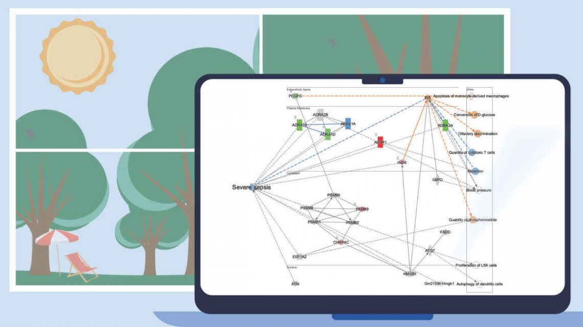
Find the unexpected with ML Disease Pathways in Core Analyses
A year ago, approximately 1500 disease and phenotype networks were created with machine learning (ML) techniques and made available in IPA. These “ML Disease Pathways” (originally called “Inferred Networks”) contain well-known genes and proteins that not only impact the diseases and phenotypes displayed in each network but also contain inferred molecules from machine learning that are not yet known to be involved, or whose relationship to these outcomes were not yet curated, in the IPA Knowledge Base (Krämer, et al. 2022). These pathways are searchable in IPA by keyword — and you can view and overlay data onto them — but until now were not scored against datasets in Core Analyses.
Now when you run a Core Analysis, these ML pathways are automatically scored by z-score and p-value to your dataset, and the results can provide an opportunity to discover potentially novel relationships between your analysis and diseases and phenotypes. As an example, Figure 5 shows the results for the ML pathways scored against the transcriptional profile of simvastatin-treated human HUVEC cells (expression data derived from GSE85799).

Figure 5. ML Disease Pathways scored against simvastatin-treated rats (liver). The most significant result by Fisher’s Exact Test (right-tailed) is “Severe sepsis".
Double-clicking on the bar for severe sepsis brings up its pathway diagram, as shown in Figure 6. The expression pattern from the overlaid simvastatin treatment (red or green nodes) combined with the effects on neighboring nodes predicted with the Molecule Activity Predictor (orange-or-blue-colored nodes) indicates that this drug may decrease sepsis. Interestingly, the Chem View page for Simvastatin in IPA indicates that the drug is in a phase 4 clinical trial in sepsis (though not severe sepsis as in this example).

Figure 6. The severe sepsis ML pathway overlaid with simvastatin differential expression data. IPA predicts that simvastatin may decrease severe sepsis.
Quickly and easily choose Canonical Pathways for display in charts
To make it simple to choose which Canonical Pathways to include in a chart, an auto-complete box has been added to the Customize Chart dialog box. If you wish to exclude a certain pathway, just start typing a word in its name, then uncheck it when you see it in the results. On the other hand, if you want to quickly focus on just one or a handful of pathways, you can uncheck the Select All checkbox first, then type text related to the pathway to find those you want to include, and finally, select their checkboxes. Figure 7 shows an example of the latter case, where the user only wants to show actin-related pathways in the chart.

Figure 7. Quickly focus on Canonical Pathways of interest in the Customize Chart dialog box. Uncheck the Select All button first (as shown) if you wish to search for and show a small number of pathways in the chart.
Other software changes
- The speed to upload and save a dataset has been improved, most noticeably for datasets with many columns.
- “Reactome” appears as a content source in certain filters in the UI in this release, however, there is currently only a minor addition of Reactome content in IPA. As we prepare to add Reactome pathways in a future release, that source currently only refers to new groups and complexes that have added from Reactome.
Content updates
Explore new areas with 10 new and 3 updated pathways
New pathways
- Acetylcholine Receptor Signaling Pathway
- Adrenergic Receptor Signaling Pathway (Enhanced)
- Cachexia Signaling Pathway
- GABAergic Receptor Signaling Pathway (Enhanced)
- Glutaminergic Receptor Signaling Pathway (Enhanced)
- ISGylation Signaling Pathway
- Microautophagy Signaling Pathway
- NFKBIE Signaling Pathway
- Orexin Signaling Pathway
- Sertoli Cell Germ Cell Junction Signaling Pathway (Enhanced)
Existing pathways updated to include an activity pattern
- IL-17A Signaling in Fibroblasts
- Sertoli Cell-Sertoli Cell Junction Signaling
- TR/RXR Activation
Addition of >400,000 new findings (bringing the total in IPA to over 12.6 million)
>29,000 protein-protein interaction findings from BioGrid
>407,000 cancer mutation findings from ClinVar
>1,800 target-to-disease findings from ClinicalTrials.gov
>1,700 drug-to-disease findings from ClinicalTrials.gov
>800 Gene Ontology findings
>220 mappable chemicals
> 3,800 Lipid Maps IDs
141,323 expression datasets (5,689 added)

If you have further questions, please contact your local QIAGEN® representative or contact our Technical Support Center at
www.qiagen.com/support/technical-support

What’s new in the QIAGEN® Ingenuity Pathway Analysis Spring Release (2023)
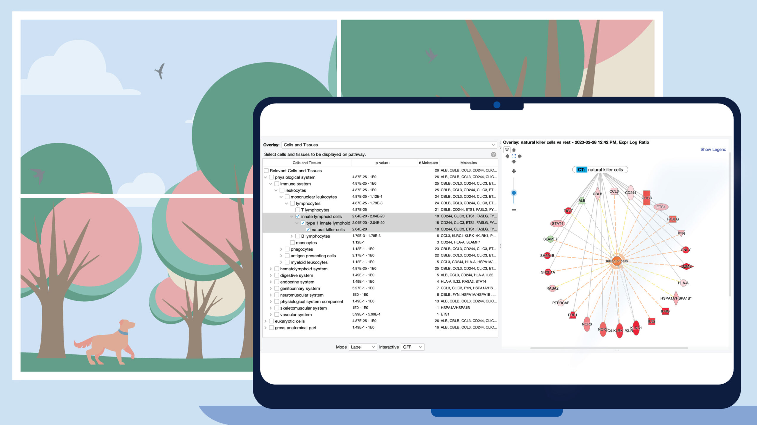
Identify potential cell types based on the set of genes on networks and pathways
Ingenuity Pathway Analysis (IPA®) can now predict cell types associated with the genes on your network or pathway. The prediction is based on an enrichment calculation for the set of genes on your pathway canvas versus sets of genes that are known to be expressed relatively highly in particular cell types. The underlying cell type expression data comes from The Human Protein Atlas (www.proteinatlas.org/).
Figure 1 shows a screenshot of the new Cells and Tissues overlay applied to a network derived from expression data from a natural killer single cell cluster (from human fetal liver, PMID 31597962). As expected, the overlay indicates that the network is enriched in natural killer cell genes (P value: 2.04E-20).
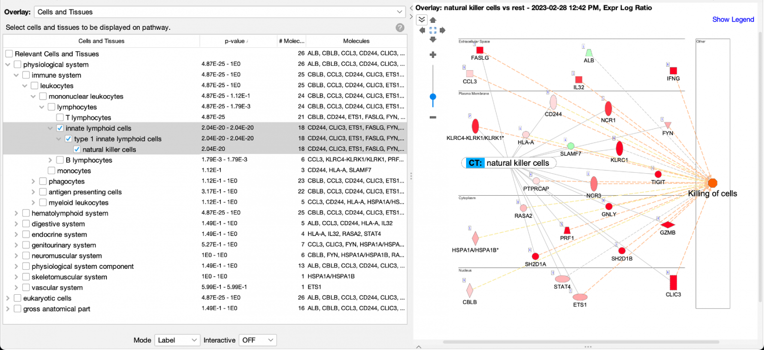
Figure 1. Enrichment of natural killer enriched genes on a network. An overlay tag (labeled “CT: natural killer cells”) was added to the pathway after the genes on the network were found to be enriched in genes expressed relatively highly in natural killer cells. CT stands for “Cells or Tissues”. The underlying sets of genes that are considered cell-type enriched are defined as genes expressed in one cell type at more than three times the median of expression across all other cell types in the collection from The Human Protein Atlas.
The cell types are organized into three major branches of the Ingenuity Ontology, namely the physiological system, eukaryotic cells, and gross anatomical part. A specific cell type will typically be found in two or three branches of those major branches. In the example of Figure 1, natural killer cells are found under the immune system (within the physiological system branch), and as shown in Figure 2, also under blood cells in the eukaryotic cells branch.
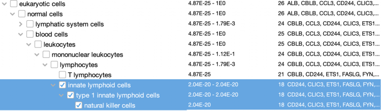
Figure 2. Natural killer cells are categorized under the eukaryotic cells branch of the Ingenuity Ontology as well.
Causally score My Pathways in Core Analysis
With this new capability in IPA, you can set a pattern of activated or inhibited genes on a My Pathway, which IPA can then score by comparing that pattern to the differential expression of the analysis-ready molecules in your dataset. In so doing, IPA can predict whether My Pathway is activated or inhibited in the context of your dataset. The activation state (red or green) for each node can be set by overlaying an analysis or a dataset, either manually with the red or green paint bucket in the MAP (Molecule Activity Predictor) feature, or by using a combination of the paint buckets along with either an overlaid analysis or dataset.
Figure 3 shows an example of a My Pathway created in IPA depicting several key epithelial–mesenchymal transition-related genes and biological functions. The gene nodes have been colored with the MAP paint buckets (red for activated and green for inhibited). Once the pathway has been saved and approved for scoring, the pathway can be scored in the context of future Core Analyses.
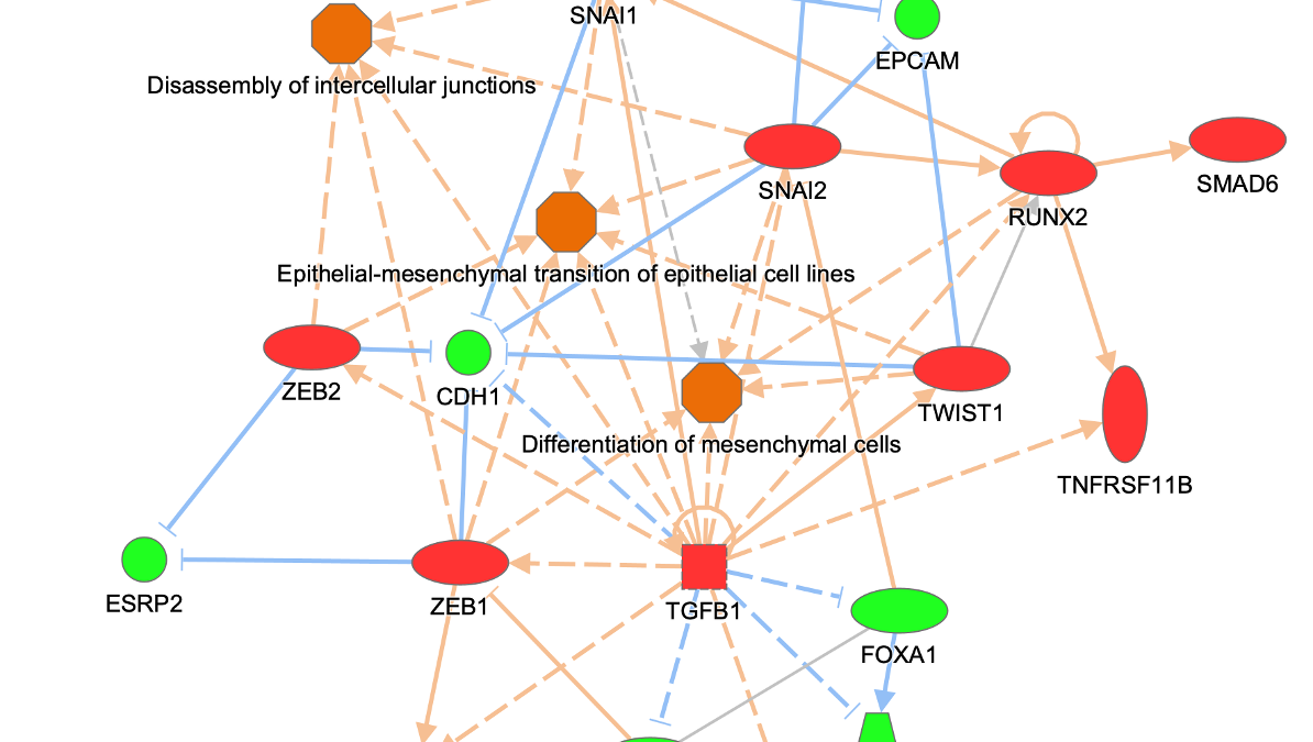
Figure 3. A custom My Pathway with nodes assigned by the user as activated (red) or green (inhibited). This pathway can be saved and scored in any future Core Analysis. Note that any orange or blue coloring for molecules or any diseases or functions are not saved as part of this pathway pattern for scoring purposes.
The scoring is done using a z score algorithm, akin to how Canonical Pathways are scored, accomplished by comparing the up- or downregulated states of the analysis-ready molecules in your dataset to the activity state (red or green color) of matching molecules on each saved My Pathway. Figure 4 shows the My Pathways tab for a Core Analysis of expression data from claudin-low breast cancer cell lines ratioed to luminal cell lines (PMID 20813035).
IPA predicts that the custom EMT “My Pathway” is activated in the aggressive cancer lines, which is the expected result for these cells. The z score is positive because the actual expression direction in the dataset (shown in the fourth column in the table in Figure 4) matches the expected direction assigned in the saved My Pathway (displayed in the seventh column in Figure 4, labeled “Expected”).
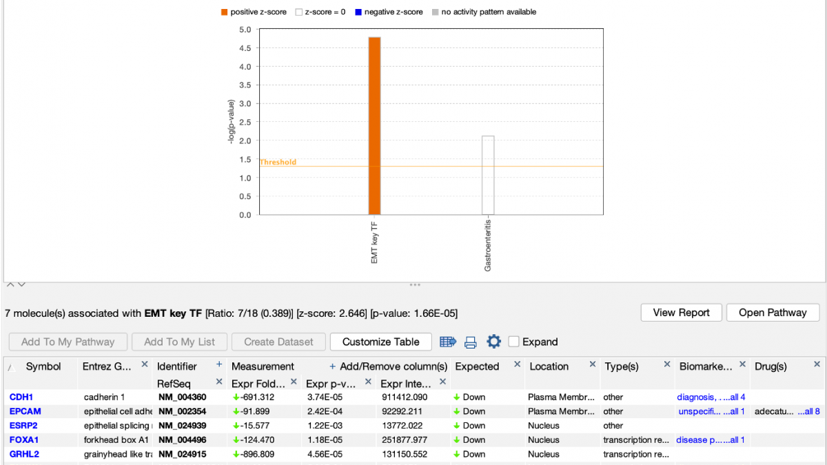
Figure 4. Causally scoring a My Pathway. The My Pathway named “EMT key TF” shown in Figure 3 has been scored in a Core Analysis and is indicated with the orange bar above. The orange color indicates the pathway is predicted to be activated in this expression analysis of aggressive breast cancer cell lines. As shown above the table, the z score for the pathway is 2.646.
This new capability provides you with the tools to create any pathway you can imagine and find out how it is impacted in your experimental setting. The genes on the pathway do not need to be connected by relationships. You can also modify a Canonical Pathway or other IPA pathway as your starting point for your My Pathway.
Set the User Dataset as the reference set when uploading a dataset
When analyzing a dataset, the most precise definition of the “universe” of genes to use in statistical calculations is the one that most closely matches the set of genes that you measured (or could measure) in your experimental setting. For example, if you are analyzing a panel of 400 genes, then the universe or “reference set” should be those 400 genes (or better yet, the subset of those genes that are measurable in the experimental conditions at hand). It would be statistically incorrect to set the reference set to all genes in the genome if you know you can only measure changes in those 400.
Or, for example, if you are performing whole transcriptome RNA-seq from mouse kidney tissue, then the reference set would ideally be the set of all genes in your experiment that you could reliably measure, for example, those with RPKM values that passed some threshold in at least one sample (e.g., RPKM > 1). That way, the universe is set to “mouse kidney-expressed genes” rather than all possible genes in the genome, some of which are not expressed in mouse kidney.
IPA has always enabled you to upload the entire set of detectable molecules and then when analyzing the data, to set the User Dataset as the reference set. However, it was easy to forget to use that setting when creating the analysis, resulting in effectively using the entire genome as the universe instead. In this release of IPA, you can set the reference set to User Dataset during dataset upload instead, when you are more likely to remember to set it correctly.
Figure 5 shows the new upload setting.
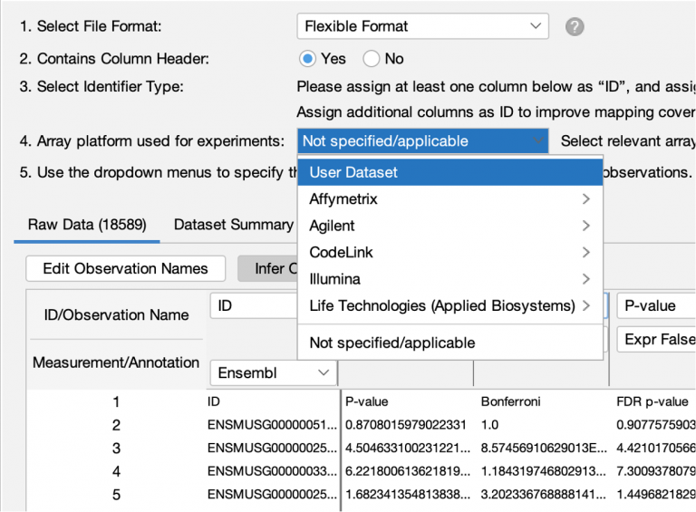
Figure 5. Setting the reference set to User Dataset reference during dataset upload.
This new feature should reduce the chance of accidentally using a less-than-ideal reference set in your analyses.
Please remember that you should not use the “User Dataset” reference set option if your dataset represents only the significantly differentially expressed genes from your experiment. In such a case, if you do not set even more stringent cutoffs at analysis time, then the statistics will be incorrect, because in that case there is no difference between the analysis-ready genes and the reference set. The statistics are designed to look for enrichment among a smaller set of genes drawn from the universe of possible genes.
Legend for Graphical Summary
A legend specific to the Graphical Summary (a tab in Core Analysis) appears in the top right corner of the screen when viewing that tab as shown in Figure 6.
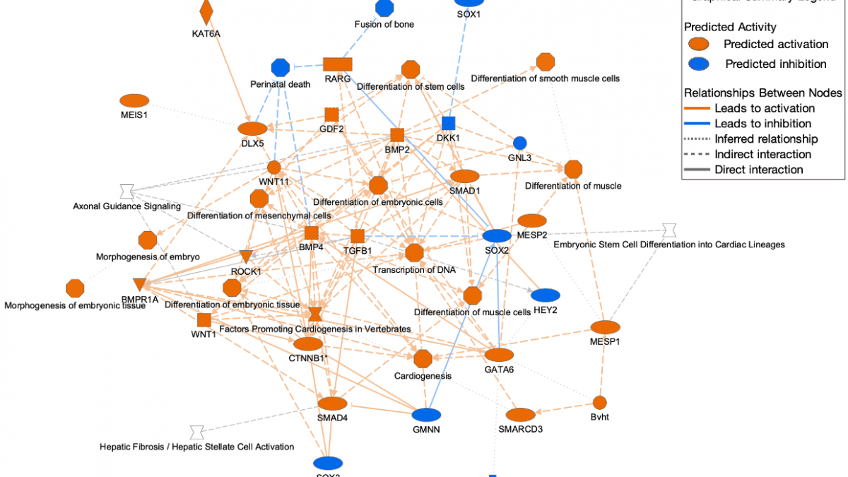
Figure 6. Graphical Summary legend. The legend appears at the top right. A high-resolution copy can be downloaded from the help portal for inclusion in publications.
Other software improvements
- The View Details menu item (available when right-clicking in a pathway canvas on nodes or in the white space between them) has been moved to the top of the right-click menu for easier access.
- Now when you right-click and re-run an analysis, the prior filters and cutoffs are automatically applied upon opening. You no longer need to click the Recalculate button to update the analysis-ready molecule counts when first opening it. Of course, if you make changes to any filters or cutoffs, you will still need to press the Recalculate button to see the effects those changes make.
- Clicking on a pathway name in the Canonical Pathways Summary tab now opens the correct tab in a Core Analysis.
- Double clicking on a horizontal bar in a bar chart now opens the corresponding pathway diagram.
- A mapping issue has been corrected where a gene symbol like C9 could be inadvertently assigned as a KEGG ID (“phosphate” in this case) instead of the correct Complement protein.
- A discrepancy has been resolved between the results of “Grow to Canonical Pathway” versus “Overlay Canonical Pathway” for groups and complexes, so now both approaches produce the same results. In prior releases, the overlay tag method was too promiscuous, by using the members of groups or complexes to seek the overlaps. For example, if you asked the question “Which Canonical Pathways overlay onto the APC-FZR1 complex (i.e., which pathways contain that complex)?”, the tag method would return the correct pathways but also additional pathways that contained just the components FZR1 or APC.
Content updates
Explore new areas with four new and four updated pathways
New pathways
- ABRA Signaling Pathway
- Activin Inhibin Signaling Pathway
- DHCR24 Signaling Pathway
- WNK Renal Signaling Pathway
Existing pathways updated to include an activity pattern
- RAR Activation
- Role of Tissue Factor in Cancer
- Serotonin Receptor Signaling
- Transcriptional Regulatory Network in Embryonic Stem Cells
Addition of >263,000 new findings (bringing the total in IPA to over 12.3 million)
- >66,000 Expert findings
- >24,000 protein–protein interaction findings from BioGrid
- >500 protein–protein interaction findings from IntAct
- >122,000 cancer mutation findings from ClinVar
- >650 Gene Ontology findings
- >800 gene to disease associations from Online Mendelian Inheritance in Man (OMIM)
- >1,800 cancer mutation findings from COSMIC
- >350 gene to disease findings from ClinGen
- >900 target-to-disease findings from ClinicalTrials.gov
- >1,100 drug-to-disease findings from ClinicalTrials.gov
- >300 gene to disease or phenotype associations from the Mouse Genome Database (MGD or "Jax”)
- >42,500 gene to cell type findings from The Human Protein Atlas (THPA)
135,641 Expression datasets will be available in mid-April 2023 (10,714 added)
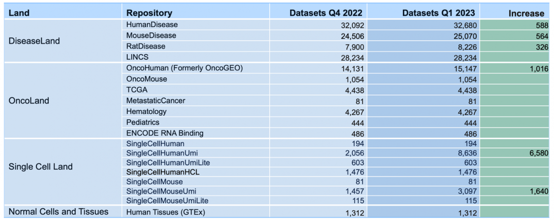
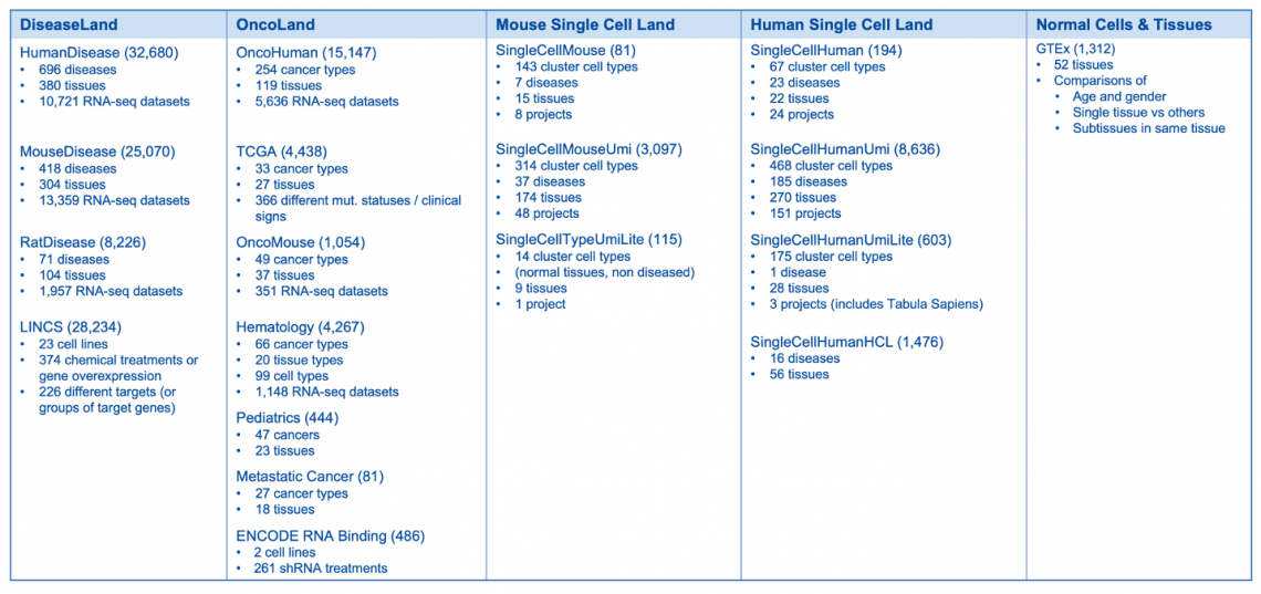
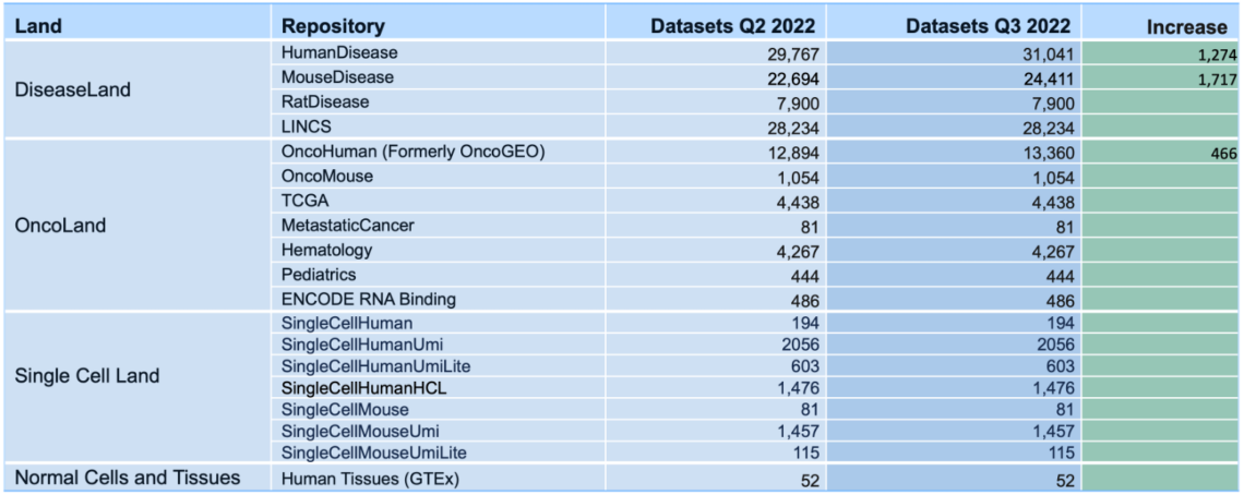
Breakdown of the OmicSoft datasets by land (mid-April 2023)
Land Explorer links for TARGET have been updated
Links on Gene Views for TARGET (Therapeutically Applicable Research to Generate Effective Treatments) for childhood cancer have been updated to point to the B38 GC33 gene model in Land Explorer, rather than the older B38 data.
If you have further questions, please contact your local QIAGEN representative or contact our Technical Support Center at www.qiagen.com/support/technical-support.

What’s new in the IPA Winter Release (December 2022)
See your Core Analysis results faster
Now you can open your Core Analysis as soon as it begins processing and view your results in real time as they become available. The analysis can be opened as soon as it is submitted by double clicking the Core Analysis icon in the Project Manager. If the icon for the analysis shows a clock ( ),the analysis is in the queue for processing, and you can view its position in the queue by double-clicking the icon. Once the analysis is running, the file icon ( ) gradually fills with green to indicate the progress of the analysis. Individual tabs appear as processing starts and each tab name changes from gray to black font when processing is complete. Some results tabs, such as Canonical Pathways, My Pathways, Tox Lists and My Lists are usually ready in less than one minute, so you can get started exploring your results right away.
Figure 1 shows a screenshot of the Summary tab, which has been re-purposed as a dashboard, showing the status of each tab while the analysis is running. Once the analysis is completely finished, the Summary tab reverts to summarizing the overall results.

Figure 1. Start viewing your Core Analysis results even as it is running. The Summary tab initially shows the status of each tab and reverts to summarizing the results once the overall analysis is finished.
Figure 2 shows the completed Canonical Pathways tab in the context of a partially complete analysis. This completed tab is fully active and usable even before the other processes (grayed out tabs) are ready.

Figure 2. The Canonical Pathway tab completes quickly. This tab is fully usable even while other tabs are still running on IPA servers.
Improved horizontal bar charts for publication
Publishers prefer compact representations of data to save page space in journals. Now, when bar charts are displayed with the horizontal option (i.e., bar orientation Is horizontal rather than vertical), the spacing of the bars is closer than previously, and the chart labels are right-aligned, as shown in Figure 3.

Figure 3. New compact layout for horizontal bar charts. The bars are now tightly spaced when the horizontal display option is chosen. Note that, for this image, font sizes have been increased to 20 points in the Customize Chart dialog.
Space-saving arrangement of Core Analysis tabs
In this release, some tabs in Core Analysis have been consolidated to be more intuitive and space-saving. The Canonical Pathways tab and the My Pathways tab have been brought together as sub-tabs under a new Pathways tab, and the Molecules tab has been moved to the rightmost position. Now, all the tabs can be seen by default without enlarging the analysis window.
Quicker access to Gene Views, Chem Views and Disease Views from networks and pathways
Now you can right-click any node in a pathway or network to see its corresponding Gene View, Chem View and Disease View web page. By right-clicking a gene node and selecting “View Details”, the Gene View page is displayed in your default web browser, as shown In Figure 4.

Figure 4. Right-click a node in a network or pathway and select "View Details" to view the details for the corresponding gene, chemical, disease or function.
Content updates
Explore new areas with four new and four updated pathways
New pathways
- Chaperone Mediated Autophagy Signaling Pathway
- IL-33 Signaling Pathway
- Myelination Signaling Pathway
- NOD1/2 Signaling Pathway
Existing pathways updated to include an activity pattern
- Adipogenesis Pathway
- Chronic Myeloid Leukemia Signaling
- IL-12 Signaling and Production in Macrophages
- Mitochondrial Dysfunction
Addition of ~120,000 new findings (bringing the total in IPA to over 12 million)
~96,000 expert findings
~10,000 protein–protein interaction findings from BioGRID
~8000 cancer-mutation findings from ClinVar
~4000 Gene Ontology findings
~1200 target-to-disease findings from ClinicalTrials.gov
~1200 drug-to-disease findings from ClinicalTrials.gov
~150 gene-to-disease or phenotype associations from the Mouse Genome Database (MGD or "Jax”)
~200 newly mappable chemicals
Identifier mapping support added for two new species
- Atlantic salmon (Salmo salar)
- Sheep (Ovis aries)
124,927 expression datasets will be available in early January 2023 (3177 added)

Breakdown of the OmicSoft datasets by Land (early January 2023)


What’s New in the IPA Fall Release (September 2022)
New addition to Canonical Pathway bubble charts
Bubble charts present multi-variate data in an easily understood graphical form that can help explain your data to your audience.
In this release, you can now show individual Canonical Pathway names along either axis.
Figure 1 shows a bubble chart that plots the predicted effects of an Nrf2-activating compound on Canonical Pathway activity in mouse kidney. The pathways are sorted by significance (Benjamini Hochberg-corrected, right-tailed Fisher’s exact test, which tests the significance of the overlap of dataset genes with each pathway) and colored according to predicted activation. The sizes of the bubbles increase with the number of genes that overlap each pathway.
The most significant pathways are on the right side of the x-axis, and, in this dataset, are mostly activated, also having the largest number of genes that overlap the dataset (as indicated by bubble size).
One advantage of this view (in contrast to the default IPA bar-chart view) is the compactness of the bubble chart. Every significant pathway is displayed in the single image in Figure 1. Bar charts tend to be much wider than bubble charts. With bubble charts, a third variable can be displayed in addition to p-value and z-score. In Figure 1, the circle size indicates the size of the overlap for each pathway.

Figure 1. Nrf2-activator Canonical Pathway scores plotted as pathway name vs. significance. The colors indicate the z-score (see legend at top right), and the size of the bubble increases with the number of overlapping genes. Therefore, the large orange bubbles at the right of the chart represent pathways that are statistically significant, are predicted to be activated, and have many overlapping genes with the dataset. The gene expression data are from kidney of mice that were fed the Nrf2 activating chemical CDDO-me (Shelton, L.M., et al, 2015, Kidney Int. 88:1261. PMC4676083). Click the figure for high-resolution image.
There are other ways to plot your data so that pathway names appear on an axis. For example, you can create a chart that emphasizes the categorization of the pathways (see Figure 2).

Figure 2. Canonical Pathway scores from single-cell data plotted as pathway name versus pathway category. This view helps you see how the pathways and their scores cluster into categories. The analyzed data are from the natural killer (NK) cell cluster from developing human liver. The data were re-processed using the CLC Workbench single-cell module from data published in Popescu, D.-M., et al (2019) Decoding human fetal liver haematopoiesis Nature 574: 365. The analysis in IPA is derived from the gene expression for the single-cell cluster of natural killer cells (compared to the rest of the clusters). As listed in the legend (top right), the bubbles are colored according to z-score, and the bubble size Is based on the -log(p-value), where the largest bubbles have the most significant Benjamini Hochberg-corrected right-tailed Fisher’s exact test scores. For example, Natural Killer Cell Signaling and T Cell Receptor Signaling pathways in the lower left corner are predicted to be activated in these NK cells. These pathways are members of the Cellular Immune Response category (as shown on the y-axis). Click the figure for high-resolution image.
Improved display of analysis names in comparison heat maps
You can now toggle the height of the column headers in heatmaps to show the full analysis names, as shown in Figure 3. The taller headers are present in exported image files as well.

Figure 3. Expand column headers in comparison heatmaps to see the entire analysis names. This expansion applies both to Comparison Analysis heatmaps and Analysis Match heatmaps. Click the figure for high-resolution image.
Content updates
Explore new areas with three new and eight updated pathways
New pathways
- S100 Family Signaling Pathway
- Neutrophil Extracellular Trap Signaling Pathway
- Macrophage Alternative Activation Signaling Pathway
Updated to include an activity pattern
- Cancer Drug Resistance by Drug Efflux
- G Protein Signaling Mediated by Tubby
- DNA damage-induced 14-3-3σ Signaling
- Human Embryonic Stem Cell Pluripotency
- IL-4 Signaling
- IL-10 Signaling
- Role of JAK family kinases in IL-6-type Cytokine Signaling
- Role of JAK2 in Hormone-like Cytokine Signaling
>1.5 million new findings (bringing the total in IPA to over 11.8 million)
~60,000 expert findings
~995,000 from TargetScan mouse
~45,000 protein–protein interaction findings from BioGrid
~5000 Gene Ontology findings
~2000 target-to-disease findings from ClinicalTrials.gov
~2100 drug-to-disease findings from ClinicalTrials.gov
~2300 protein–protein interaction findings from IntAct
~1000 findings from the Online Mendelian Inheritance in Man (OMIM)
~600 gene-to-disease or phenotype associations from the Mouse Genome Database (MGD or "Jax”)
~18,500 from Human Metabolome Database (HMDB)
~550,000 findings from The Human Protein Atlas (THPA)
121,750 expression datasets will be available mid-October (3,457 added)

What’s New in the IPA Summer Release (July 2022)
Visualize your data in new ways with Canonical Pathway bubble charts
Bubble charts present multi-variate data in an easily understood graphical form that can help explain your data to your audience. Now, you can display and export bubble charts in QIAGEN Ingenuity Pathway Analysis (IPA) for your Core Analysis Canonical Pathway scores. For example, Figure 1 shows a bubble chart which plots the effect of an NRF2 activator on Canonical Pathway activity. In this chart, the scores are organized by pathway category and colored according to predicted activation.
In this example, the bubble size is related to the number of genes that overlap each pathway. The figure shows that this NRF2 activator turns on multiple pathways related to xenobiotic metabolism, toxicity and cellular stress (see bottom right area of Figure 1). These pathways also exhibit a higher number of overlapping genes relative to other pathways in the chart.

Figure 1. NRF2 activator Canonical Pathway scores arranged by category. The colors indicate the z-score, and bubble size corresponds to the number of overlapping genes. The large orange bubbles represent pathways that are statistically significant, predicted to be activated, and have many overlapping genes from the dataset. Gene expression data from Shelton, L.M. et al. (2015) Kidney Int. 88-1261. PMC4676083.
There are several ways to plot your data with the new bubble charts. For example, you can create a chart similar to the one in Figure 2 to spotlight the highly significant and activated pathways with many overlapping genes (see top right of chart).

Figure 2. NRF2 activator pathway data plotted to highlight the most significant pathways that are activated or inhibited. Pathway bubbles near the top of the chart are the most significant. The blue bubbles towards the left are inhibited, and the orange bubbles towards the right are activated. As in the other figures, the size of the bubbles is proportional to the number of overlapping genes.
Visualize OmicSoft single-cell data in Land Explorer
Now you can easily explore single-cell expression for any gene in the public data curated by OmicSoft. These single-cell views are available via new links in IPA Gene Views (Figure 3).

Figure 3. New links for single-cell views in Gene View (highlighted in the red box).
Improve the readability of your networks with new node-label placement
The labels of nodes (e.g., gene names, disease names) in IPA networks can now be positioned below their node shapes to make them easier to read, especially when they otherwise would be superimposed over dark fill colors. Figure 4 below shows two examples of IPA networks in which the node labels are positioned below their corresponding shapes.

Figure 4. Interpret your networks more readily with the node labels placed below the node shapes. Examples are shown for Graphical Summary (left) and for an interaction network in which the data values also displayed (right).
Expand your research with support for the upload of new species datasets
Now you can analyze datasets from a wider range of species in IPA, including crab-eating macaque, pig and Chinese hamster ovary (CHO) cells. IPA now supports an additional 11 species for a total of 25 supported species.

See this help article for the full list of 25 species.
Take advantage of inferred disease and phenotype networks with Search
When investigating a disease, it is useful to understand the key genes involved and how they interact to drive the occurrence or severity of the condition. To this end, a large library of Disease and Phenotype Networks has been created by leveraging an unsupervised machine learning (ML) model of the literature-derived QIAGEN Knowledge Graph (QKG).
Each network in the collection focuses on a single disease or phenotype and contains key genes and impacted biological functions, as well as relationships between, them that drive the condition. In addition, a colored pattern of predicted activation is overlaid to show how the activation or inhibition of genes leads to the disease.
The intent is to provide a relatively small snapshot of the primary factors involved. The network does not contain all molecules known to be related to the disease in the QKG; including all molecules would often result in an unreadable, densely connected network with hundreds, if not thousands, of nodes. Instead, the ML algorithm prioritizes the most important genes and functions and generates networks of reasonable sizes (~50 nodes on average) that provide a good overview in a comprehensible manner.
This release provides >1,500 of these networks, which are also now fully discoverable in Search. As shown in Figure 5, you can search for these networks in the Pathways and Lists tab using terms, such as diseases, phenotypes or gene names.


Figure 5. Discover IPA’s recently developed Disease and Phenotype networks via Search. In the top panel, the disease term "cholestasis" has been used to search, whereas, in the bottom panel, the gene name "ABCB4" has been used. Each row in the results is a specific network. Clicking a blue hyperlink in the result will open the corresponding network.
To make such prioritizations, the algorithm uses unsupervised gene and function embeddings derived from causal relationships in the QKB. Unlike many ML applications for biology, the algorithm does not train on differential expression or other forms of raw data; instead, it leverages the QKB's causal associations curated from biomedical literature by experts for more than 20 years. More details about the approach are available in our recently published paper: “Mining hidden knowledge: Embedding models of cause-effect relationships curated from the biomedical literature", Krämer, A., et al. (2022) Bioinformatics Advances.
The results are generated algorithmically without further curation by human experts. Each network generally includes well-known participants in the disease and predicts new associations not previously present in the QKB. Some of these predictions may be opportunities for novel discoveries.
Speed up your work by opening Canonical Pathways directly from links in Gene Views
Clicking a Canonical Pathway name in a Gene View will now open the pathway in the IPA client, as shown in Figure 6. The gene of interest will be highlighted in the opened pathway.

Figure 6. Canonical Pathway links on Gene Views. Clicking a link opens the pathway diagram and highlights the corresponding gene of interest (i.e., the gene represented by the clicked Gene View).
Reduced runtimes for Core Analysis
With this update, Core Analyses complete more quickly than before. Improving the performance of IPA is an important issue to the IPA team at QIAGEN, and this is the first of several performance improvements in upcoming releases.
Option to turn Molecule Activity Predictor (MAP) off by default
Now you can turn off MAP prediction by default (Preferences > Application Preferences > Graph Appearance). MAP is normally turned on by default, so that, if you open a pathway from an analysis, the MAP color overlay is automatically enabled. Now you can turn off MAP prediction globally and still have the option to use it in an “on demand” fashion with the MAP option in the Overlay menu.
Single sign on availability
The latest version of the IPA client launcher (https://analysis.ingenuity.com/pa/installer/select) enables signing on using your institution’s single sign on (SSO) service. Using SSO means that you no longer need to maintain a separate password for IPA or perform multi-factor authentication (e.g., requesting an emailed code) — you simply use the same institutional password that you are already using at work for other systems. This is a free (no cost) service. For more information, visit https://apps.ingenuity.com/ingsso/ssoInstructions.
Content updates
Explore new areas with 10 new Canonical Pathways
- CDX Gastrointestinal Cancer Signaling Pathway
- Immunogenic Cell Death Signaling Pathway
- Macrophage Classical Activation Signaling Pathway
- MicroRNA Biogenesis Signaling Pathway
- Multiple Sclerosis Signaling Pathway
- Pathogen-Induced Cytokine Storm Signaling Pathway
- Ribonucleotide Reductase Signaling Pathway
- Role of Chondrocytes in Rheumatoid Arthritis Signaling Pathway
- Role of Osteoblasts in Rheumatoid Arthritis Signaling Pathway
- Role of Osteoclasts in Rheumatoid Arthritis Signaling Pathway
>450,000 new findings (bringing the total in IPA to over 10.3 million)
~45,000 Expert findings
~400,000 cancer mutation findings from ClinVar
~18,000 protein–protein interaction findings from BioGrid
~2100 target-to-disease findings from ClinicalTrials.gov
~1900 drug-to-disease findings from ClinicalTrials.gov
~800 Gene Ontology findings
~300 protein–protein interaction findings from IntAct
~180 gene to disease or phenotype associations from the Mouse Genome Database (MGD or "Jax”)
~40 chemical to cancer findings from the Chemical Carcinogenesis Research Information System (CCRIS)
~175 newly mappable chemicals
118,293 expression datasets are now available (6,858 added)

This release offers a new source of data, ENCODE RNA binding, which contains RNA-seq experiments of 1122 samples for two popular cell lines (K562 and HEPG2) after shRNA knockdown targeting various proteins (Van Nostrand, E.L., et al. (2020) Nature 583:711; https://www.nature.com/articles/s41586-020-2077-3):
- RNA-binding proteins
- Transcription factors
- Cofactors
- DNA repair proteins
- Chromatin remodeler proteins
- RNA-polymerase complex
- DNA replication proteins
These are represented by 486 comparison datasets in IPA. You can also look up the absolute expression or the differential expression for a gene of interest among these shRNA treatments. Look for the links entitled “ENCODE RNA-associated gene knockdown” in any Gene View in IPA.

What’s New in the IPA Spring Release (April 2022)
Improved ease of use and increased search capabilities
The Search tool in IPA is now easier to use because all search options have been consolidated to the main tool bar. Furthermore, you can speed up your research by finding entities (i.e., genes, chemicals, diseases and biological functions) of interest inside Canonical Pathways and Tox Lists. You can also search for your own custom pathways and lists either by name or by entities within them — even in notes you have added to the pathways.
For example, you can search for a gene name, such as “FASLG”, and find all the pathways and lists in which the gene participates (Figure 1).

Figure 1. A search for FASLG in “Pathways and Lists” returned 57 Canonical Pathways and Tox Lists in which FASLG is a participant. In prior releases of IPA, this query would not have returned results, as the prior search tool searched pathway names and categories only, and did not search entities contained within the pathways or lists.
Likewise, a search for a disease of function term will find Canonical Pathways or Tox Lists for which the term is either in a node on the pathway or in the pathway’s name (Figure 2).

Figure 2. Searching for a disease node within pathways and lists finds one match in the name of one pathway and several matches inside another pathway.
For Canonical Pathways, the search automatically “expands” groups and complexes to look within them for genes and protein names. For example, a search for RAF, ARAF, BRAF or RAF1 would return a Canonical Pathway that contains the group “RAF”. Note, however, that, when you open the pathway, you will not immediately see the ARAF, BRAF or RAF1 nodes as they are members of the RAF group, which appears as a single node in the diagram. You can manually expand the RAF node to view these molecules using the “Expand Members/Membership” option available in the Graph Options button in the My Pathways toolbar or from the menu that appears when you right-click the group.
Content updates
>1,275,000 new findings (bringing the total in IPA to over 9.8 million)
~83,000 Expert findings
~187,000 protein–protein interaction findings from BioGrid
~4,600 gene-to-cancer-type findings from Catalogue of Somatic Mutations in Cancer (COSMIC)
~1,800 target-to-disease findings from ClinicalTrials.gov
~1,800 drug-to-disease findings from ClinicalTrials.gov
~1,000 newly mappable chemicals
~950 gene-to-disease associations from Online Inheritance in Man (OMIM)
~600 protein–protein-interaction findings from IntAct
~300 gene-to-disease or -phenotype associations from the Mouse Genome Database (MGD or "Jax”)
~180 chemical-to-cancer findings from the Chemical Carcinogenesis Research Information System (CCRIS)
~14,000 cancer-mutation findings from ClinVar
~600 target-to-disease findings from ClinicalTrials.gov
~800 drug-to-disease findings from ClinicalTrials.gov
~55 newly mappable chemicals
~1,000,000 RNA expression-to-cell-type findings from The Human Protein Atlas (THPA). In this release, this new content source is used only for filtering in Tissue and Cell Lines filters and includes 49 cell types.
>3,492 new expression datasets (for a total of >112,000) available in Analysis Match, Activity Plot and Pattern Search

What’s New in the IPA Winter Release (December 2021)

Explore previews of disease and phenotype networks
Explore >1500 new networks, which integrate key molecules that impact a single disease and its associated phenotypes. Machine learning was used to create disease, phenotype and function networks by mining the QIAGEN Knowledge Base. Whereas many genes in each network are known players in the disease, some genes are inferred to impact the disease and may represent novel participants in the disease or its etiology.

Figure 1: Example of a Disease and Phenotype network. Machine learning techniques and other heuristics were used to prioritize key genes that impact psoriasis and to associate the disease with potential phenotypes. The nodes have been colored to indicate their predicted activity in the network: red and green nodes indicate increased or decreased activity in the disease state, respectively. To make it easier to see the molecules and other nodes, the relationship lines in the network have been faded using the “Fade Edges” feature of PathTracer (described below, see Figure 5).
For example, in the psoriasis network shown in Figure 1, the TANK gene is predicted to be activated in the disease state. Yet this gene, highlighted in Figure 2, is not directly connected to psoriasis or its phenotypes in the Knowledge Base at this time. Intriguingly, a search of the literature finds a possible connection between TANK and psoriasis: the authors state that “ubiquitination events involving UBAC1 and TANK should be considered within the molecular mechanisms that modulate the physiological function of CARMA2sh and of its psoriasis-linked mutants. Future work will further address this aspect.” (Mazzone, P. et al. 2020).

Figure 2: New psoriasis network with PathTracer applied. The network shows that TANK is connected to other genes, but is not directly connected to psoriasis or other phenotypes.
The networks are experimental and are not meant to comprehensively catalog every gene associated with a particular disease. Rather, these networks have been constructed to visualize a human-readable set of the most important genes causally connected to the disease and phenotypes and to one another. The networks may help identify genes with similar regulatory patterns that implicate them as potentially important in the disease. Note that all the relationships in the network are supported by findings from the Knowledge Base, and that these networks were not inferred using any expression datasets. In particular, the red and green coloring in the networks is derived from prediction, not expression data.
The methodology used to create these Disease and Phenotype networks in IPA is described in this submitted manuscript: https://www.biorxiv.org/content/10.1101/2021.10.07.463598v1.full.pdf
Disease names in the networks can be browsed alphabetically in the “Disease and Phenotype Networks” subfolder within the Project Manager “Libraries” folder, as shown in Figure 3. Double click an icon to view the network of interest.

Figure 3: Location of the preview for the Disease and Phenotype Networks in the Project Manager.
Currently, these networks are not searchable in IPA, nor are they scored in analyses. You can, however, 1) overlay your own analyses or datasets on the networks, 2) copy them to your own project folders and approve them for p-value scoring in your own analyses or 3) click the Pattern Search button to explore whether OmicSoft analyses have an expression pattern that matches or anti-matches a particular network.
For a list of the networks and to look up which genes and functions are in them, see this Excel spreadsheet.
We would appreciate any feedback you have about these networks. Send your feedback with the “Provide Feedback” link at the top of the main IPA window.
Improvements to enhance interpretation in IPA
- Easily access IPA Land Explorer with a new direct link at the top of the IPA window. Figure 4 shows the “QIAGEN Land Explorer” link and the resulting Land Explorer Sample Browser view that is launched in your default browser.

Figure 4: Direct link to QIAGEN Land Explorer.
Please note that, although a user with any IPA license type can launch this sample browser view, an IPA Analysis Match Explorer license is needed to drill down further into Land Explorer.
Contact support or your QIAGEN customer solutions manager if you wish to inquire about upgrading to a license that includes QIAGEN OmicSoft Land Explorer.
- Now you can customize any network or pathway to make it easier to see the nodes by fading the saturation of relationship lines (or “edges”) using the revised PathTracer tool, as shown in Figure 5.

Figure 5: PathTracer can now be used to fade all the relationships (edges) in a network. Fading the edges can make it easier to see the nodes on the pathway, as shown in this Graphical Summary network.
- The gene names on Canonical Pathways have been standardized with the most up-to-date, official gene symbols for consistency and familiarity. Figure 6 shows part of a Canonical Pathway with the gene names from the prior release (left side) and from this release (right side). The displayed gene names now match those found in your dataset.

Figure 6. Gene names have been standardized to their official symbol as used elsewhere in IPA (right panel).
- The MAP feature is now on by default to enhance interpretability of pathway and networks. For example, now when you open a Canonical Pathway from an expression analysis, the MAP feature predicts how the up-and down-regulated genes in your dataset impact other molecules and functions in their neighborhood. In the right panel of the figure below, MAP shows that cardiogenic functions at the bottom of the pathway are predicted to be increasing in this particular dataset (indicated in orange, Figure 7).

Figure 7: MAP is now enabled by default. Opening a pathway from an analysis will automatically show the orange (increasing) and blue (decreasing) prediction coloring of nodes as shown in the right panel.
The latest IPA client installer is required to launch IPA
The client installer for IPA has been updated and now includes OpenJDK Java (version 11.0.2) instead of Oracle Java. The installer supports two-factor authentication (2FA), which all users are now required to use.
Go to https://analysis.ingenuity.com/pa/installer/select to download and install the new IPA client installer on your computer at your earliest convenience. The page hosts installer packages for both Windows PCs and Macs.
Note that rare problems can occur with some computer hardware and OpenJDK, causing a gray summary screen in Core Analyses, a white area after searching, or other display issues. As a workaround, Customer Support can provide a 2FA-enabled version of the IPA installer that uses Oracle Java instead of OpenJDK. Please contact Customer Support at ts-bioinformatics@qiagen.com if you experience these or any other issue with the new installer.
Content updates
Six new Canonical Signaling Pathways
- CLEAR Signaling Pathway
- ID1 Signaling Pathway
- IL13 Signaling Pathway
- Oxytocin in Brain Signaling Pathway
- Oxytocin in Spinal Neurons Signaling Pathway
- SNARE Signaling Pathway
Activity pattern added and content updated for two pathways
- FAK Signaling Pathway
- GADD45 Signaling Pathway
Activity pattern added for one pathway
- PXR/RXR Activation Pathway
>56,000 new findings (bringing the total in IPA to over 8.5 million), including:
~41,000 Expert findings
~14,000 cancer mutation findings from ClinVar
~600 target-to-disease findings from ClinicalTrials.gov
~800 drug-to-disease findings from ClinicalTrials.gov
~55 newly mappable chemicals
>6700 new expression datasets (for a total of >109,000) available in Analysis Match, Activity Plot and Pattern Search

Note that the recent TCGA metadata upgrade from OmicSoft is not yet included in the TCGA comparisons found in IPA and will be added in the Q1 2022 IPA release.
What’s New in the IPA Fall Release (September 2021)

Improve the presentation of your Canonical Pathway bar chart results
There are several new ways to customize your bar charts to make them easier to present and publish.
- Tailor the bar chart to include or exclude pathways that contain a particular gene. Simply click the Customize Chart button and enter a gene of interest to limit the pathway bar chart to pathways that include that gene name. Or if desired, filter away all the pathways that contain a particular gene or set of genes. The genes you use to filter must be overlapping the pathway from your dataset. The pathways in the example below are filtered to display only those that contain the ETS1

Canonical pathways for a breast cancer dataset filtered to display only pathways containing the ETS1 gene.
- Focus on pathway activity by sorting the bars or columns by z-score. The chart below has been sorted by z-score. As the y-axis scale for the chart remains -log(p-value), bar height is proportional to its right-tailed Fisher’s Exact Test significance; however, the bars are ordered on the x-axis from positive to negative z-score.

The unfiltered Canonical Pathway bar chart of the breast cancer pathways are arranged so that the pathways with the highest positive z-scores (predicted activation) are at the left .
- Customize the font sizes in the chart for publication and presentation. You can increase the size of the font used in the bar chart, making the font larger for publications (compare the figure below with the figure above).

The figure above was modified to increase the font size of the bar and y-axis labels.
New IPA client installer: Please take action before December 2021
The client installer for IPA has been updated and now includes OpenJDK Java (version 11.0.2) instead of Oracle Java. The installer supports two-factor authentication (2FA), and all users will be required to use 2FA as of the December release of IPA.
The new installer will be required to launch the upcoming December release of IPA. Download the installer from https://analysis.ingenuity.com/pa/installer/select. This page hosts installer packages for both Windows PCs and Macs. Note that a 32-bit version of OpenJDK is not available, so Windows users with a 32-bit operating system must instead download the Oracle Java version (also available from the link above). After downloading, install the new IPA client installer on your computer at your earliest convenience.
If you are unable to upgrade to the new installer for some reason, you can use Web Start with Oracle Java to launch IPA. Web Start cannot, however, be used with a Mac that has an M1 chip, as Oracle does not supply a version of Java Web start that is compatible with the M1 chip for Macs. Therefore, M1 Mac users must upgrade to the new installer to run the IPA December release.
Please contact Customer Support at ts-bioinformatics@qiagen.com if you experience any issues with the new installer.
Content updates
Six new Canonical Signaling Pathways
- Neurovascular Coupling Signaling Pathway
- Oxytocin Signaling Pathway
- Pulmonary Fibrosis Idiopathic Signaling Pathway
- Pulmonary Healing Signaling Pathway
- Pyroptosis Signaling Pathway
- Wound Healing Signaling Pathway
Activity pattern added and content updated for two pathways
- G-Protein Coupled Receptor Signaling Pathway
- Polyamine Regulation
Content updated for one pathway
- Circadian Rhythm Signaling
>325,000 new findings (bringing the total in IPA to over 8.4 million), including the following:
~143,000 Expert findings
~66,600 protein–protein interaction findings from BioGRID
~400 protein–protein findings from IntAct
~12,000 findings from COSMIC
~86,350 cancer mutation findings from ClinVar
~12,000 findings from the Mouse Genome Database (MGD)
~1430 findings from the Online Mendelian Inheritance in Man (OMIM)
~1800 Gene Ontology findings
~1400 target-to-disease findings from ClinicalTrials.gov
~1800 drug-to-disease findings from ClinicalTrials.gov
~300 newly mappable chemicals
>6000 new datasets (for a total of >102,000) will soon be available in Analysis Match, Activity Plot and Pattern Search

Over 102,000 OmicSoft analyses are currently being computed on our servers and will be released when they have completed in the first week of October, 2021.
The more than 6000 additional analyses include a new Land repository called “Normal Cells and Tissues”. In this release, this Land contains 52 comparisons, based on RNA-seq data from the GTEx consortium, in which a set of samples from a single normal human tissue type is compared to a pool of samples taken from a large variety of other normal tissue samples.

IPA’s Graphical Summary of the “Brain – Hippocampus vs Others” comparison.
Normal tissue comparisons are useful for looking at tissue-specific markers and, for example, for matching with single-cell analyses.

“Brain – Hippocampus vs Others” analysis is matched against all single-cell data in IPA.
For Land Explorer users, the GTEx differential expression is available for each gene on IPA Gene Views.

What’s new in the IPA Summer Release (July 2021)
New Pattern Search instantly discovers relevant QIAGEN OmicSoft analyses
The new Pattern Search capability in IPA builds on Analysis Match by enabling you to instantly scan >96,000 OmicSoft analyses starting with any collection of genes in a network or pathway as your “query”. With Pattern Search, you can answer questions, such as:
- Which analyses activate this Canonical Pathway through the same genes as in my analysis?
- Which analyses of diseased tissue are the “opposite” of the gene signature for my drug and may benefit from treatment with the drug?
- Do any analyses have an interaction network or Regulator Effects network similar to the one in my analysis?
Start with any network or pathway from an analysis, or simply place genes of interest into a new My Pathway, then either overlay a dataset or manually color the genes with the MAP paint bucket to “activate” or “inhibit” them. Click the “Pattern Search” button to discover which OmicSoft analyses have similar or different gene expression patterns. You can subsequently create a gene heatmap to examine how the analyses match your query gene by gene.
For example, a set of gene signatures representing the consensus transcriptional effects of certain classes of drugs or chemicals in cell lines has been published (PMID 30552330). Figure 1 shows a My Pathway in which the HDAC inhibitor signature from the paper has been added. Pattern Search compares the added set of up- and down-regulated genes to the significantly differentially expressed genes in the >96,000 OmicSoft datasets.

Figure 1: A simple gene pattern (as a query) in a My Pathway. This signature represents the consensus transcriptional effects of HDAC inhibitors in cell lines, which the authors derived using LINCS project data (PMID 30552330). The genes indicated in red are expected to be up-regulated and in green down-regulated by HDAC inhibitors. Clicking the highlighted “Pattern Search” button searches the >96,000 OmicSoft analyses for genes with a matching or anti-matching pattern of up- or down-regulation, as shown in Figure 2.
The query pattern closely matches a number of LINCS datasets from cancer cell lines that have been treated with various HDAC inhibitors, such as belinostat and mocetinostat (see Figure 2). This pattern is expected for a positive control, as the paper used data from the LINCS project as input to originally create the signatures.
This result indicates that the z-score algorithm, used for matching, effectively finds the appropriately matching datasets. Note that this z-score algorithm simply evaluates whether the “analysis-ready” genes in each OmicSoft analysis directionally match the query signature pattern. In other words, genes that are either activated/upregulated (red) or inhibited/downregulated (green) in both the query and the analysis contribute positively to the z-score.

Figure 2: The HDAC signature strongly matches the expression after LINCS HDAC-inhibitor treatment for various cell lines. As expected, the Pattern Search algorithm recovered the matches to the varieties of LINCS datasets that would be expected from this query signature. These LINCS matches can be filtered to explore unexpected matches as well (see Figure 3).
Filtering out the LINCS datasets to focus on other dataset sources, matches were detected to other experiments involving treatment with HDAC inhibitors, such as SAHA treatment of cell lines for neuroendocrine tumor, colon cancer and bladder cancer (see Figure 3). There were also matches to datasets unrelated to HDAC inhibitors. For example, one match is for a dataset involving ixazomib treatment of non-resistant control cells. Ixazomib, a proteasome 20S subunit beta 5 inhibitor, has been shown to act synergistically with HDAC inhibitors in Hodgkin and T-cell lymphomas (PMID 31452195). Thus, the Pattern Search results uncovered datasets that are unexpected but biologically relevant for follow up.

Figure 3: The HDAC signature strongly matches non-LINCS datasets as well. Filtering the data sources used in Figure 2 to exclude selected dataset sources identified unexpected results that could be interesting to follow up. In this example, the HDAC-treated gene expression pattern matched with analyses of other treatments, such as ixazomib.
From the Activity Plot (such as those in Figures 2 or 3), you can easily create a gene heatmap to examine exactly which genes were significantly differentially expressed in the matching or anti-matching analyses. Figure 4 shows a gene heatmap with the query analysis in the leftmost column and several matching HDAC inhibitor-treatment analyses in the other columns.

Figure 4: The gene heatmap shows the details of how the query signature matches selected analyses. In this example, the HDAC signature is shown in the leftmost column as solid red or green squares indicating genes that are expected to be up-regulated down-regulated, respectively, in the matching analyses. Color intensity indicates the actual log-fold changes with a few matching analyses from the OmicSoft collection. Analyses were selected according the use of various cell lines treated with SAHA. The selected analysis, highlighted in blue, displays its associated metadata in the table on the right. Note that none of the matching analyses are a perfect match for the query, but there are clear similarities among the differentially expressed genes.
It is important to note that Pattern Search works with up- and-down-regulated genes in the query as well as with the inferred activities of nodes produced by Molecule Activity Predictor (MAP). For example, you can use a Regulator Effects network as a query, which displays up- and down-regulated target genes from your dataset (indicted in red and green, respectively), and also indicates activation and inhibition of the inferred upstream regulators with orange and blue, respectively. In this case, activated upstream regulators are treated as up-regulated (red) and inhibited upstream regulators are treated as down-regulated (green) in the query pattern. Figure 5 illustrates this query and the results.

Figure 5: Pattern Search uses both known and inferred activity in the query. In this example, the query uses a Regulator Effects network as a query. For the purpose of pattern matching, the upstream regulators SNAI1 and F2R are treated as upregulated and CCN5 as downregulated. Functions, such as the epithelial-mesenchymal transition, are not used in the query as they will never match the OmicSoft datasets, which consist solely of molecules such, as genes or proteins.
Pattern Search is the newest of several different approaches to augment your biological interpretation in IPA by using the OmicSoft expression analyses. Figure 6 highlights the rationale behind each of these approaches.

Figure 6: The three different features of the “Analysis Match” capability in IPA.
Note that Pattern Search and the other features shown in Figure 6 require an Analysis Match license for your IPA account. If this license is not currently active for you, contact customer support or your local QIAGEN Account Manager for more information about gaining access to this feature.
Comparison Analysis from Activity Plot results
You can now create a Comparison Analysis directly from any Activity Plot, including plots in Pattern Search, as shown in Figure 7.

Figure 7: Create a Comparison Analysis directly from selected rows in the Activity Plot table. In this example, the Activity Plot (left) was used to search for matching OmicSoft Lands datasets in which the upstream regulator NFE2L2 was significantly involved. The “comparisoncategory” column was filtered to include only datasets that were collected from treated samples. After selecting the top five results in the Activity Plot table and clicking the “View Comparison” button, a heat map (right) was calculated using the Hierarchical Clustering options for both the Canonical Pathways and the analyses.
Newly revised Land Explorer links in Gene Views improve navigation
The Land Explorer links section in IPA Gene Views now provides direct links to additional Lands and views in Land Explorer and the available data sources are labeled more clearly. For example, there are now links to survival plots and to sources such as ICGC (International Cancer Genome Consortium) that had not been directly linked before (Figure 8).

Figure 8: Revised Land Explorer links section in Gene Views. The links are categorized by source, type, consortia, etc. Now you can navigate directly to additional views and Lands.

Figure 9: A Kaplan–Meier survival curve is now just one click away from a Gene View in IPA. This survival curve was generated from the FOXM1 Gene View by clicking the “TARGET” link in the Survival by Expression row in the Oncology Consortia column shown in Figure 8. This view shows the survival rate over time and is categorized based on the expression of this gene.
Improve publications by customizing font size in networks and pathways
To communicate the importance of certain nodes or tags in a network or pathway, the font size can be selectively increased or decreased. These changes can easily be made by selecting one or more nodes or tags and using the new font size button, as shown below in Figure 9.

Figure 10: Now you can enlarge the font on just one node or tag using the new font size button. The importance of these nodes or tags can be emphasized by font size and provide better communication with your pathway images.
Content updates
New Canonical Signaling Pathway
- CSDE1 Signaling Pathway
Updates to four existing Canonical Signaling Pathways
- Base Excision Repair Pathway
- Epithelial Adherens Junction Signaling Pathway
- Gustation Pathway
- Phagosome Formation Pathway
>300,000 new findings (bringing the total in IPA to over 8.1 million), including the following:
>238,000 expert findings
>6600 protein–protein interaction findings from BioGRID
>2200 protein–protein findings from IntAct
>1000 findings from Clinical Genome Resource (ClinGen, a new source for this release)
>51,000 cancer mutation findings from ClinVar
>12,700 findings from the Mouse Genome Database (MGD)
>5600 findings from the Online Mendelian Inheritance in Man (OMIM)
>100 Gene Ontology findings
>1300 target-to-disease findings from ClinicalTrials.gov
>1800 drug-to-disease findings from ClinicalTrials.gov
~350 newly mappable chemicals
>6000 new datasets (for a total of >96,000) are now available in Analysis Match, Activity Plot and Pattern Search

Table 1: OmicSoft analysis content in Analysis Match, Activity Plot and Pattern Search. More than 6000 new analyses have been added in this release.
What’s New in the IPA Spring Release (March 2021)

Easily find relevant analyses in the 90,000+ dataset Analysis Match collection
Searching for analyses and datasets of interest to view or overlay is now much easier and more accurate with filterable and customizable metadata columns. Simply enter keywords of interest in a project search, and then use the filters above the metadata columns to narrow the results to exactly what you need.

Data Search and Analysis has new options for searching and filtering. This example shows a search to find mouse liver studies of NASH.
Elucidate biology by finding enriched subcellular locations
The subcellular locations of proteins can provide clues to their function and role(s) in the cell. For example, proteins found in the mitochondria will have different roles than those found in lysosomes.
Now, you can automatically discover and annotate the detailed subcellular locations of molecules in any network or pathway with detailed subcellular locations of the molecules.

A pathway configured to show subcellular localization information.

Detail of the above pathway showing proteins that are localized to the Golgi apparatus.
Other application improvements
- Autocomplete has been improved for genes and chemicals.
- Gene Views, Chem Views, Canonical Pathway Reports, etc., have been updated with a new look and feel.

New appearance of the Gene View.
Content updates
New QIAGEN OmicSoft Single Cell Land and SARS-CoV-2 datasets are included with the more than 90,000 datasets that are now available in Analysis Match.

Two new Canonical Signaling Pathways
- Dilated Cardiomyopathy Signaling Pathway
- NAD Signaling Pathway
Addition of Activity Patterns to four existing Canonical Signaling Pathways
- Autophagy
- T Cell Receptor Signaling
- Regulation of IL-2 Expression in Activated and Anergic T Lymphocytes
- Dendritic Cell Maturation
One updated Canonical Signaling Pathway
- Coronavirus Pathogenesis Pathway
>120,000 new findings (bringing the total in IPA to over 7.8 million), including the following:
- >37,000 expert findings
- >39,000 protein–protein interaction findings from BioGRID
- >22,100 cancer mutation findings from ClinVar
- >12,700 findings from the Mouse Genome Database (MGD)
- >5600 findings from the Online Mendelian Inheritance in Man (OMIM)
- >2200 Gene Ontology findings
- >3600 drug-to-disease findings from ClinicalTrials.gov
- >3900 target-to-disease findings from ClinicalTrials.gov
- 273 newly mappable chemicals
What’s New in the QIAGEN IPA Winter Release (December 2020)
Work faster with improved overlay and access to networks
In this release, several features in IPA have been improved for ease of use. An important aspect of IPA is the ability to overlay and visualize data on a network or pathway. Now, you can simultaneously see more rows in the ‘Matching molecules’ table and more easily display node bar charts on a network or pathway.
In the ‘Matching molecules’ table in ‘Overlay’ > ‘Analyses, Datasets, & Lists’, the default view now shows only the overlaid expression or phosphorylation measurement type (such as ‘fold change’) rather than all the available measurement types in the dataset. This modification enables you to view more rows of the table and is especially useful when the dataset has several measurement types (such as ‘p-value’, ‘FDR’ and ‘Intensity’). Additionally, when you add a second analysis or dataset, the small bar charts (node charts) now appear next to the nodes in the network or pathway by default (see Figure 1).

Figure 1: Streamlined overlay of ‘Analyses, Datasets, & Lists’ content. The defaults and controls for data overlay have been changed to simplify your work, allowing you to view more rows at once by default. Now, only the measurement that is overlaid on the network or pathway (such as ‘log ratio’ or ‘fold change’) is shown in the ‘Matching molecules’ table at the left. You can click the gear icon  to add more measurement types for display. In addition, by default, node bar charts will appear automatically on the network or pathway at the right when multiple analyses or datasets are overlaid. In prior releases, you had to first select one or more rows in the ‘Matching molecules’ table to show the bar charts in the network.
Another improvement in this release allows you to visualize a miRNA–mRNA network directly from ‘microRNA Target Filter’ with one click. Select one or more rows in the dataset and click the new ‘Display as Network’ button (see Figure 2) to create a ‘My Pathway’, which automatically shows the miRNAs connected to their targets.

Figure 2: New ‘Display as Network’ button in ‘microRNA Target Filter’. Visualize rows in ‘microRNA Target Filter’ as a network by selecting one or more rows and clicking the ‘Display as Network’ button. The miRNAs are connected to their targets with miT and E edges (miRNA targeting and expression, respectively).
To ensure consistent network visualization in IPA, the ‘Display as Network’ button is also available in the ‘Causal Networks’ and ‘Regulator Effects’ tabs in ‘Core Analyses’.
Search and filtering of ‘Analysis Match’ analyses enhanced with added metadata
Now there are more ways to find and filter relevant analyses: ‘PubMed ID’ and ‘Therapeutic Area’ fields have been added to QIAGEN OmicSoft datasets and analyses. In Figure 3, a PubMed ID (PMID) is used in the ‘Dataset and Analysis Search’.

Figure 3: Searching for OmicSoft datasets using PMIDs. Enter only the integer portion of the PMID to search, as shown.
You can also search the OmicSoft ‘Therapeutic Area’ metadata with many keywords, such as neurology, rheumatology or endocrinology.
Content updates
Three new Canonical Signaling Pathways
- Ferroptosis Signaling Pathway
- Role of MAPK Signaling in Inhibiting the Pathogenesis of Influenza
- Role of MAPK Signaling in Promoting the Pathogenesis of Influenza
Addition of Activity Patterns to three existing Canonical Signaling Pathways
- HER-2 Signaling in Breast Cancer
- IL-17 Signaling
- Role of Hypercytokinemia/hyperchemokinemia in the Pathogenesis of Influenza
>104,000 new findings (bringing the total in IPA to over 7.7 million), including the following:
~24,000 expert findings
~44,000 cancer-mutation findings from ClinVar
~18,000 protein–protein-interaction findings from BioGRID
~2,300 Gene Ontology findings
~750 drug-to-disease findings from ClinicalTrials.gov
~600 target-to-disease findings from ClinicalTrials.gov
~31,000 protein–protein-interaction findings from IntAct
~500 newly mappable chemicals
>6900 new datasets for a total of >80,000 in Analysis Match and Activity Plot

Table 1: OmicSoft analysis content in ‘Analysis Match’ and ‘Activity Plot’. More than 6900 new analyses have been added in this release.
What’s New in the IPA Fall Release (October 2020)
QIAGEN IPA has an all new look!
The new look of this IPA release includes a redesigned Quick Start window and highly informative short videos to help orient you with quick overviews of IPA’s key features. The new look brings sharper graphics, new iconography and crisper fonts to IPA.

The new look for IPA. Almost all of the functionality of the new version is the same as the prior version, but now has a new appearance.
Please note that Mac users must switch to using the native command key modifier for Mac OS when using IPA. For example, to select all nodes in a network, press ⌘-A on the keyboard for Mac (instead of control-A, used for Windows).
Although any recent IPA installer is compatible with this release, we recommend downloading the latest IPA installer to obtain the new app icon: https://analysis.ingenuity.com/pa/installer/select. Note that IPA requires Java 8 or higher (which is built into this installer) to launch.
Get oriented quickly with the Quick Start window
The IPA Quick Start window has been reimagined to provide helpful explanations and links so that you can use IPA more effectively right away. You will find sections on how to analyze various data types, links to the top help articles, new case studies, shortcuts to the main functions in IPA, how to contact Support and more.

The new Quick Start window. Headers at the left of the Quick Start give you an overview of available content: click the header to view the content. To open this window, go to Help > Quick Start or press control-9 on your keyboard for Windows or ⌘-9 for Mac).
New short videos for Core Analysis and My Pathways
New short videos can be accessed from the Core Analysis tabs. To view a video, click the video play button icon , which appears in the right corner of most tabs. As an example, here is a video for Upstream Regulators in IPA. A new overview video is also available for the My Pathway window.
Graphical Summary
The new IPA Graphical Summary provides you with a quick overview of the major biological themes in your IPA Core Analysis and illustrates how these concepts relate to one another. This feature selects and connects a subset of the most significant entities predicted in the analysis, creating a coherent and comprehensible synopsis of the analysis. The Graphical Summary can include entities such as canonical pathways, upstream regulators, diseases and biological functions. The algorithm constructs the summary using machine learning techniques to prioritize and connect entities and infers relationships to connect entities not yet connected by findings in the QIAGEN Knowledge Graph. These inferred relationships help you visualize related biological activities.
The Graphical Summary tab is available in the Core Analysis window. The example below shows the Graphical Summary result for an expression analysis of aggressive “claudin-low” breast cancer cell lines compared (i.e., ratio’ed) to less aggressive luminal A type breast cancer cell lines. In this dataset, which is based on PMID 20813035, the epithelial-mesenchymal transition (EMT) in claudin-low cells has been activated by specific transcription factors, such as ZEB1, SNAI1 and SNAI2, and the cells exhibit tissue-invasive tendencies — all of which are well represented in the generated summary:

The new Graphical Summary presents a synopsis of the top results from your Core Analysis as a small network. The algorithm for this feature uses a number of methods, including machine learning, to select and connect the top predicted entities. Analyses run prior to this release will take a little longer to open the first time they are viewed as IPA generates and saves the network presented in the Graphical Summary.
The summary takes a number of factors into account and is described in more detail in this help article. If you wish, you can generate a new summary with more or fewer nodes, and these changes will be saved automatically with your analysis.
Add “sticky” notes directly to a My Pathway
This release enables you to add any number of “sticky” notes to a network or pathway to help you capture ideas or details of interest. Simply add notes to a pathway or network and save as a “My Pathway”. This tool is helpful for explaining the components of a custom pathway to others.

Communicate more effectively by adding your own notes to pathways and networks. Make notes for yourself or to share with others. You can attach notes to individual molecules and relationships or to provide general information about the pathway. Save the annotated pathway or share with your colleagues.
Content updates
Four new Canonical Signaling Pathways
- Coronavirus Replication Pathway
- Tumor Microenvironment Pathway
- MSP-RON Signaling in Cancer Cells Pathway
- MSP-RON Signaling in Macrophage Pathway
Addition of Activity Patterns to two existing Canonical Signaling Pathways
- Erythropoietin Signaling Pathway
- Breast Cancer Regulation by Stathmin1
Approximately 425,000 new findings (bringing the total in IPA to over 7.6 million)
Now more than 73,000 OmicSoft Analyses available in Analysis Match and Activity Plot

OmicSoft analysis content in Analysis Match and Activity Plot. More than 7,700 new analyses have been added in this release.
What’s new in the QIAGEN IPA Summer Release (June 2020)
Discover more with Activity Plots that now include your own analyses
Now you can explore the predicted activity of a single IPA entity such as an Upstream Regulator, Causal Network, Disease/Function, or Canonical Pathway across your own analyses (in addition to the >65,000 from OmicSoft).
Figure 1 shows an Activity Plot for the upstream regulator NFE2L2 (also known as Nrf2). Two of the selected analyses (green dots) are highlighted with a red box. These are analyses from the user’s own projects that predict high activation of NFE2L2, and they also appear in the table below the chart. The results suggest that NFE2L2 can be activated in hepatocellular carcinoma (HCC) tumors, because the datasets were derived from expression data from patients with HCC (GSE33294).
This new Activity Plot feature will help you identify interesting and relevant analyses you have run previously in QIAGEN IPA.

Figure 1: Activity Plot for NFE2L2 as an upstream regulator.
Each dot in the plot represents the scores for NFE2L2 in an individual analysis, where the dot’s position represents its z-score (x-axis) and p-value (y-axis) in the analysis. NFE2L2 is predicted to be activated in an analysis when its z-score is ≥2. Note that several analyses have been selected (green dots), and two of the selected analyses are from the user’s projects. The Activity Plot feature is included with Analysis Match licenses in IPA.
Other enhancements to launching and using Activity Plot
- When searching for a gene or chemical in IPA and then selecting one to display in an Activity Plot, you can now choose whether to display it as an upstream regulator (as before), or as a causal network master regulator of depth 1, 2, or 3.
- When you launch an Activity Plot from an entity in an analysis, the “dot” for that analysis is automatically selected in the plot (shown as bright green) and displayed as a row in the table below the plot so it is easy to see.
- Now you can export the Activity Plot as an image (JPEG, PDF, PNG, TIFF, or SVG), or export the table of selected analyses as text or .xls.
Other improvements
- Get insights faster when using the Analysis Match heatmap by viewing additional information added to the hover panel. The Comparison Contrast metadata field is now shown for an OmicSoft analysis when hovering over a heatmap square or column in the Analysis Match heatmap. This field is a concise description of what is being compared between the experimental and control samples in each differential expression dataset. Figure 2 shows an example.

Figure 2: Improved hover panel in the Analysis Match heatmap.
The Comparison Contrast field is shown as the second line in the panel. This example indicates that the analysis is a comparison of prednisone treatment vs. none.
- Speed your workflow with improved Autocomplete in search. As you type underneath either of the three search tabs at the top of the IPA main window, you will see matching terms appear much more quickly than in the past.
- Customize IPA for your research by importing your own pathways from external files in formats such as XGMML, SIF, BioPax and more. For example, you can bring in networks and pathways you generated in Cytoscape. In this release, import has been improved in the following ways:
- If the edge types are not specified in the file you wish to import, IPA will automatically retrieve the edge types and the underlying findings between the two nodes in the QIAGEN Knowledge Base during upload.
- Now you can import a directory of pathway files as a batch. This feature is for evaluation purposes at this time (Beta).
Content updates
QIAGEN Coronavirus Networks
Recently, Gordon et al. identified human host proteins that interact with SARS-CoV-2 viral proteins using an affinity-purification mass spectrometry screen. We extended this work using the QIAGEN Knowledge Base, by connecting the SARS-CoV-2 host proteins to biological functions or diseases likely affected by viral infection in order to explore how the virus may interfere with various host cell functions, and also to identify additional drug targets and other genes that could potentially be modulated as therapy towards COVID-19. The results are presented as interactive network visualizations, that allow exploration of underlying experimental evidence, made available to the scientific community with the Coronavirus Network Explorer.
In this release of IPA we have made the same networks available within the IPA app in a new My Pathways folder in a Project folder called QIAGEN Coronavirus Networks:

Figure 3: QIAGEN Coronavirus Networks folder in IPA. Seventy specially constructed coronavirus-host protein networks are now available in IPA. If you wish to score these networks in your Core Analyses, please copy them to your own Project Folders and approve them for scoring. Note you will be scoring overlap of your datasets to the host proteins, not to the viral proteins.
Note that information about viral proteins and their connections to the host genes networks cannot be viewed by double-clicking on their nodes, as IPA currently supports only human, mouse and rat identifiers.
Six new Canonical Signaling Pathways
- Coronavirus Pathogenesis Pathway
- Insulin Secretion Signaling Pathway
- Kinetochore Metaphase Signaling Pathway
- Regulation Of The Epithelial Mesenchymal Transition By Growth Factors Pathway
- Regulation Of The Epithelial Mesenchymal Transition In Development Pathway
- Semaphorin Neuronal Repulsive Signaling Pathway
Addition of Activity Patterns to three existing Canonical Signaling Pathways
- Spliceosomal Cycle
- HIF1α Signaling Pathway
- Nur77 Signaling in T Lymphocytes
~64,000 new findings (bringing the total to over 7.25 million findings), including:
- ~37,500 Expert findings
- ~17,700 Protein-protein interaction findings from BioGRID
- ~8000 Gene Ontology findings
- ~1700 Drug-to-disease findings from ClinicalTrials.gov
- ~1400 Target-to-disease findings from ClinicalTrials.gov
- ~325 Findings from Mouse Genome Database (JAX)
- ~170 Protein-protein interaction findings from IntAct
Also:
169 newly mappable chemicals
COVID-19 is now in the disease ontology with findings from ClinicalTrials.gov

Figure 4: BioProfiler displaying a disease search of ‘COVID-19’. There are three related COVID-19 terms now in the QIAGEN Ontology: COVID-19, Mild COVID-19, Severe COVID-19, and Critical COVID-19. Currently they are backed with findings from ClinicalTrials.gov.
>65,000 OmicSoft Analyses available in Analysis Match and Activity Plot

Table 1: OmicSoft analysis content in Analysis Match and Activity Plot.
What’s New in the IPA Spring Release (March 2020)
Make discoveries by exploring a particular QIAGEN IPA “entity” with the new Activity Plot
Now you can visualize and explore the activity of a single QIAGEN IPA entity, such as an Upstream Regulator, Causal Network, Canonical Pathway, Disease or Function, across >60,000 OmicSoft Land analyses. The Activity Plot is a novel approach that helps you gain insights into an IPA entity by exploring its predicted biological activity across thousands of datasets that represent disease conditions, drug or other treatments, knockouts and much more in the Analysis Match database. Please note that the Activity Plot feature is included with Analysis Match licenses in IPA.
With this new capability, you can answer questions, such as “Which treatments are predicted to inhibit the epithelial to mesenchymal transition (EMT)? What disease states activate the ILK Signaling Pathway? In which cancer types is STAT3 activated as an upstream regulator?”
The figure below shows the predicted activity of the EMT function across >60,000 analyses in the Analysis Match database. EMT is significant in >3500 analyses (represented by the dots in the plot and indicated in the plot title). A subset of analyses with strong inhibition of EMT (z-score < –2) were selected and further filtered for those of the comparison type “Treatment vs. Control” (green dots in the image).

Many of the compounds that are predicted to inhibit EMT are kinase inhibitors, such as erlotinib, selumetinib, AZD8330, KIN001-043 and others. Selumetinib is a MEK inhibitor and a known inhibitor of EMT (PMID: 28179307). Interestingly, a top scoring analysis (that is not a compound) is an siRNA knockdown of the Q61R NRAS activating mutation, underscoring that an NRAS mutation can drive EMT but can be reversed by knocking down the expression of the mutated gene. Finally, the HDAC inhibitor pracinostat scored strongly and was recently shown to reverse EMT in a breast cancer cell line (PMID: 32109485). Data mining using the the IPA Activity Plot may help you discover novel inhibitors of EMT or other diseases and functions.
An Activity Plot for an upstream regulator is shown below. In the plot, 49 analyses for which SMAD4 is predicted to be activated as an upstream regulator are highlighted in green.

You can also run a quick computation to evaluate whether any particular metadata values are significantly enriched in the selected analyses compared to all of the unselected analyses. Notably, TGF, TGF beta and TGF beta1 (all synonyms of TGF-) were identified as metadata terms significantly enriched in the analyses that activate SMAD4. In each case, the cells or tissue had been exposed to TGF-, and, in each case, SMAD4 was predicted to be activated. This result confirms published research that has identified SMAD4 as a “central mediator” of TGF- signaling (PMID: 29483830)

Explore a massive collection of ‘omics data with QIAGEN Land Explorer integration
To enable deeper exploration across ‘omics data for individual genes, expression correlation across genes and visualization of the expression details of Analysis Match datasets, this release brings a large expansion of the integration between QIAGEN IPA and QIAGEN Land Explorer. Now you can seamlessly jump from IPA into more granular sample- and gene-level details in Land Explorer, the web-based portal to OmicSoft’s massive Lands databases of curated disease ‘omics data (>500,000 samples). With this capability, you can navigate from a gene of interest in IPA to quickly discover its tissue or cell expression, the diseases and treatments that cause it to be up-or-down-regulated, the cancers in which it is frequently mutated, the effect of mutations on patient survival and much more.
You can easily answer questions, such as “Is ALAS2 expressed in a certain type of blood cell or cell line? In which types of viral infection is IRF7 upregulated? Is the expression of IRF7 and CXCL10 correlated, and, if so, in what tissues, cell types or disease conditions? In which cancer types is SMAD4 most often mutated, and how does that affect patient survival?”
Links to help you easily answer these questions have been added to IPA Gene Views, connecting you directly to the relevant visualization in Land Explorer. Note that accessing these links requires a Land Explorer license. However, as part of this IPA release you are automatically enrolled in a free 30-day trial of Land Explorer starting March 29th 2020.

Each OmicSoft link in a Gene View leads to a particular data visualization in Land Explorer. For example, the figure below shows the default Land Explorer view when clicking the HumanDisease link in the OmicSoft Differential Expression section for IRF7. Each dot in the visualization represents an analysis corresponding to an Analysis Match dataset, and the dot’s size and position correspond to the statistical significance of IRF7 and fold change in the analysis. Note that many of these comparisons involve treatments and other perturbations.

You can easily limit the results to datasets that are relevant to you by using filters to reveal that IRF7 has been observed to be up-regulated in several types of human infections, in particular, Dengue hemorrhagic fever and influenza.

Another option is to examine the expression of IRF7 in various hematopoietic cells by clicking the BluePrint link from the Gene View. IRF7 is expressed most abundantly in neutrophils.

You can also create visualizations in Land Explorer, such as survival plots, and gene–gene correlation plot, such as the correlation plot for IRF7 and CSF3 shown below. The two genes are clearly expressed in a similar manner; for example, they are both highly expressed in macrophages. In contrast, IRF7 is uniquely expressed in certain memory effector T cells, and CSF3 is present in a particular pancreatic cancer cell line that does not express IRF7.

The figure below is a survival plot for SMAD4 indicating that mutations in this gene reduce the duration of patient survival for pancreatic adenocarcinoma.

Land Explorer offers many more visualizations linked from IPA than can be shown here. Please visit this page for more information: https://digitalinsights.qiagen.com/products-overview/discovery-insights-portfolio/content-exploration-and-databases/qiagen-omicsoft-land-explorer/
Finally, IPA users with both Analysis Match and Land Explorer licenses can navigate to a volcano plot in Land Explorer for each underlying Analysis Match dataset with just one click from Project Search results or from the Analysis Match tab.


Explore cancer mechanisms by visualizing fusion genes in your networks and pathways.
Now you can explore fusion-gene biology in cancer by adding known fusion genes to your networks and pathways. There are approximately 500 fusion genes available in IPA today, with Gene Views and interactive nodes that can participate in networks and pathways.
The image below displays a small network created by adding the BCR-ABL1 fusion gene to a blank pathway. A subset of other molecules, pathways and diseases were added to extend the network upstream and downstream of the fusion gene, and the Molecule Activity Predictor or MAP tool was used to simulate adding the drug imatinib to the system. The same types of relationships used for “standard” genes are used for fusion genes, as shown in the figure.

Fusion genes have an associated Gene View, such as the one for NPM1-ALK:

Several Canonical Pathways contain fusion genes; for example, Chronic Myeloid Leukemia Signaling is shown below.

Content updates include approximately 139,000 new findings, which bring the total to over 7.1 million findings.
Five new Canonical Signaling Pathways
- BEX2 Signaling Pathway
- Necroptosis Signaling Pathway
- Xenobiotic Metabolism General Signaling Pathway
- Xenobiotic Metabolism CAR Signaling Pathway
- Xenobiotic Metabolism PXR Signaling Pathway
Addition of Activity Patterns to 10 existing Canonical Signaling Pathways
- Antiproliferative Role of TOB in T Cell Signaling
- Estrogen Receptor Signaling
- Factors Promoting Cardiogenesis in Vertebrates
- IL-15 Production
- IL-15 Signaling
- Myc Mediated Apoptosis Signaling
- Natural Killer Cell Signaling
- Role of PKR in Interferon Induction and Antiviral Response
- Thyroid Cancer Signaling
- Vitamin-C Transport
 
 
What's new in the QIAGEN IPA Winter 2019 Release
Now with Analysis Match Metadata Evaluator and more

Increase your interpretation power with the new Analysis Match Metadata Evaluator
Now you can quickly discover expected and unexpected commonalities among sets of analyses of interest in Analysis Match using a new capability that detects statistically significant associations in their metadata. For example: Are the analyses that match yours often derived from a particular tissue type, disease state or treatment? Do they tend to derive from a particular mouse strain, or from cells with specific cell surface markers? This approach can help easily identify similarities among matching analyses that may have been previously hidden.
QIAGEN IPA scans across more than 90 metadata fields from the set of repository-based analyses that you select in Analysis Match and performs a calculation to detect potential enrichment among their metadata. Figure 1A shows an Analysis Match result filtered for analyses that strongly match (or anti-match) an analysis of gemfibrozil-treated rats. Gemfibrozil is a classical PPAR agonist. Selecting the matching set (those in the red dotted box in Figure 1A) and then clicking the Evaluate Metadata button generates p-values that are calculated using a right-tailed Fisher’s Exact Test. The results are displayed in a table like the one shown in Figure 1B. The most significant term among the selected analyses is ‘PPAR agonists’ in Figure 1B in the case.subjecttreatment field with p-value = 6.98E-08. Other examples of overrepresented terms are ‘white adipose cell’ and ‘preadipocyte’ in the case.celltype field.
Note that the case.subjecttreatment and case.celltype fields are not shown in the Analysis Match table by default, calling attention to the fact that this new feature sifts through and surfaces metadata which may be initially hidden, due to space constraints in the user interface (UI).
A.

B.

Figure 1: New feature in Analysis Match to discover commonalities among analyses of interest via shared metadata. Figure 1A shows Analysis Match results for the transcriptomics analysis of the liver of rats who were treated with the PPAR-alpha agonist gemfibrozil (RNA-seq data from PMID 25150839). The table has been filtered to retain only the strongest matching (average matching percentage >43) or anti-matching analyses (average matching percentage < -43). The matching analyses enclosed in the red dotted box were selected and the ‘Evaluate Metadata’ button was chosen. Figure 1B shows the results of the enrichment calculation, where the term ‘PPAR agonists’ was found to be highly enriched (p-value = 6.98E-08) among the matching analyses in the ‘case.subjecttreatment field’. This level of significance arose because of the 18 analyses that were selected, three of them shared the ‘PPAR agonists’ term, while there are only nine analyses in the entire set of over 57,000 analyses in the Analysis Match repository with that term. Other examples of overrepresented terms are ‘white adipose cell’ and ‘preadipocyte’ in the ‘case.celltype’ field.
The analyses that were identified as being treated with “PPAR agonists” were specifically treated with tesaglitazar, fenofibrate, or rosiglitazone, which are well-known PPAR agonists.
The metadata results table can be filtered to focus on certain fields or terms of interest. In Figure 2, the metadata evaluation results are narrowed to show only fields involving the ‘case’ samples (rather than the controls).

Figure 2: Filtering the metadata results table. You can filter the results data to focus on certain types of fields or values, such as fields involving the cases rather than the controls.
Note that the computation only considers the metadata in the repository-based analyses. It does not evaluate any metadata that you may have entered for any of your own analyses.
Speed up your exploration of diseases and functions on pathways and networks
The Build > Grow > Diseases & Functions feature is a powerful way to add biological context to a pathway or network. However, its calculation of statistical over-representation is computationally expensive and often takes 30–60 seconds. In the past, after performing the first ‘Grow to Diseases & Functions’ operation on a network, QIAGEN IPA would repeat the calculation immediately any time nodes were added or subtracted from the network, forcing you to wait for updated statistical results with each change. Now you control when to perform the calculation using the new Recalculate button (Figure 3). You can make numerous changes, and when ready, determine which diseases and functions are statistically relevant.

Figure 3: Recalculate over-representation of Diseases & Functions on demand. Now you can make multiple additions or subtractions to the network or pathway before performing the computationally expensive overlap calculation.
Support for import of .csv dataset files
QIAGEN IPA now supports the upload of .csv dataset files. Some upstream software such as 10x Genomics Loupe Cell Browser exports comma-separated data files. QIAGEN IPA now supports their direct import.
Content improvements and updates
Three new Canonical Signaling Pathways
- Inhibition of ARE-mediated mRNA Degradation Pathway
- Senescence Pathway
- Hepatic Fibrosis Signaling Pathway
Addition of Activity Patterns to six existing Canonical Signaling Pathways
- Cell Cycle Control of Chromosomal Replication
- Crosstalk between Dendritic Cells and Natural Killer Cells
- Endoplasmic Reticulum Stress Pathway
- RAN Signaling Pathway
- Reelin Signaling in Neurons
- Unfolded Protein Response Signaling Pathway
Now you can enjoy nearly 175,000 new findings (with a total of over 7 million findings), as well as ~350 newly mappable chemicals, including:
- ~80,000 new Expert findings
- ~62,000 new Gene Ontology findings (primarily rat-related)
- ~27,000 protein-protein interaction findings from BioGRID
- ~6000 protein-protein interaction findings from IntAct
- ~1400 new disease-to-target findings from ClinicalTrials.gov
- ~1200 new drug-to-disease findings from ClinicalTrials.gov
What's new in the IPA Fall 2019 Release
Interactive Canonical Pathway nodes and an option to save your Build tool filter preferences
Make new connections by adding interactive Canonical Pathway nodes to networks and pathways
Increase data interpretation power and simplify pathway modeling by adding interactive nodes representing Canonical Pathways to networks or pathways. These newly available nodes correspond 1:1 with the Canonical Pathways that have always been in IPA and behave similarly to disease or function nodes. You can connect them to molecules that are part of each particular Canonical Pathway and simulate the effect of activating or inhibiting these molecules on the pathway as a whole. The activity simulation is available only for pathways that have a Pathway Activity Pattern.
Figure 1 shows the TNFR1 signaling pathway as a node on a ‘My Pathway’ connected to its primary activating ligand TNF. IPA’s MAP tool was used to “activate” TNF (shown in red), predicting this would lead to activation of the TNFR1 pathway (shown in orange).

Figure 1. An example of a Canonical Pathway displayed as an interactive node in IPA (connected to its principal activating ligand for purposes of illustration).Each pathway can be linked to the full collection of genes that make up that pathway by using the Build > Grow tool, starting with the pathway node. The interactive pathway diagram that accompanies each Canonical Pathway can be visualized by double-clicking the pathway icon. Note that when using the Grow tool to go from a pathway node to genes, all genes that are part of that pathway are added to the pathway, including those that are members of groups and complexes. If you wish to find all the genes that are included in a pathway for scoring against your dataset, it is best to use the search engine to search for that pathway, and add both the pathway and the nodes to a new ‘My Pathway’. This method will show the groups and complexes that belong to the pathway but are not included in scoring. These nodes can be removed with the Build > Trim tool.
Canonical Pathway nodes can be added to any network to increase interpretability. Figure 2 shows an example of adding Canonical Pathway nodes to an interaction network from a Core Analysis of stem cells differentiating to cardiomyocytes, indicating that several of the molecules in the network are activators of the apelin endothelial signaling and paxillin signaling pathways.

Figure 2. Two Canonical Pathways manually added to an interaction network. Using Build > Grow, Canonical Pathways were added to a pre-existing interaction network from a Core Analysis.
You can also add Canonical Pathways to Regulator Effects networks or include them inside other Canonical Pathways, as shown in Figures 3 and 4, respectively.

Figure 3. Two Canonical Pathways manually added to a Regulator Effects network. Using Build > Grow, Canonical Pathways were added to a pre-existing Regulator Effects network from a Core Analysis. These pathways are predicted to be activated due to the increased activity of the molecules colored in red in the network.

Figure 4. Canonical Pathway manually added inside another Canonical Pathway. Using Build > Grow, Canonical Pathways can be added inside another Canonical Pathway. The MAP tool coloring indicates the added pathway is inhibited (blue color) with this overlaid dataset.
Over 90 pathways in IPA have an existing pathway embedded within them, represented as a single node. Previously, these were shown using a non-interactive node. Now, these “pathways on pathways” are interactive and their activity can be predicted. Figure 5 shows a portion of the CDC42 signaling pathway that embeds two Canonical Pathways (ERK/MAPK signaling and SAPK/JNK signaling) which are predicted to be activated downstream of the CDC42 pathway.

Figure 5. Canonical Pathways already existing inside another Canonical Pathway.Over 90 pathways in IPA already have one or more Canonical Pathways embedded within them. The MAP tool in IPA was turned on to predict the effect of activating c-RAF and the JNK protein family on each of the connected pathways.
Streamline your work by saving Build tool filter preferences
When using Build tools such as Grow and Connect, sometimes you need to repeatedly perform the same operations on every network or pathway that you open. For example, you might need to always Grow upstream to transcription regulators. Now, you can make the appropriate selections in the various Build filters and save them as defaults. From that moment on, each new Build tool you use will remember your saved settings. You can always reset your custom settings back to “factory defaults” when needed.

Figure 6. The new “save as preferences” in the context of the Grow tool.The node types of ligand-dependent nuclear receptor and transcription regulator have been saved as defaults. Now, whenever a pathway or network is opened, the Grow tool will add molecules only of that type. The Build Preferences panel in IPA’s Application Preferences will show your saved settings as shown in Figure 7.

Figure 7. The new Build Filters preferences.> The panel is located in File > Preferences > Application Preferences.
What's new in the QIAGEN IPA Summer 2019 Release
New overlay feature, additional filters and two new canonical pathways
Explore new Canonical Pathways related to two important research topics
Enhance your research and discovery of the mechanisms driving the development of lupus and cancer immunotherapy with these new pathway maps:
Quickly add contextual data to any network or pathway with Search and Overlay
Now from the Overlay tool, you can search for analyses and datasets to overlay onto networks and pathways, rather than by manually browsing in the Project Manager tree. Furthermore, Analysis Match analyses and datasets from OmicSoft are included in the search results for users with an Analysis Match QIAGEN IPA license.

This workflow enables rapid visual assessment of any analysis or dataset on the pathway or network of interest. The figure below shows the Interferon Signaling Pathway overlain with expression data from mouse lung infected with an Influenza A virus vs. uninfected lung (analysis from GEO dataset GSE36328 as processed by OmicSoft for Analysis Match).

Focus on what’s important to you in your Core Analysis with additional filters
In this release, many more columns in the Core Analysis tabs are filterable, which will help you narrow down and focus your results. Furthermore, now you can use the less than (<) or greater than (>) symbols to tailor the results.

The new filters can be found in the following tabs: Upstream Analysis, Diseases & Functions, Regulator Effects, Networks, and Molecules. Some of the filters also appear in Comparison Analyses.
Clearer descriptions of Analysis Match datasets and analyses
Metadata values that differ between case and control are now displayed in a table at the top of the metadata panel in the Project Search results. An example is shown in the figure below.

Also, specific fields that are important in understanding the dataset (such as the organism, tissue and platform) have been extracted into a small section called “Comparison Context” that follows the case/control table.
If you have chosen to use the standard QIAGEN IPA case and control metadata keys for your datasets, they will also be automatically displayed in a table and placed into the Comparison Context section.
What’s new in the QIAGEN IPA Spring 2019 Release
We are excited to introduce brand new features in the QIAGEN IPA Spring 2019 Release:
Get more complete mapping during dataset upload
QIAGEN IPA can now improve your success of mapping identifiers in your datasets by evaluating more than one column of gene or chemical IDs. Assign up to five columns of IDs, and QIAGEN IPA will scan from left to right across the columns of identifiers and stop (for that row) when it successfully maps an ID.
Mapping across multiple columns of IDs is especially valuable in the case of metabolite (chemical) IDs. Figure 1 shows a dataset during the upload process with four columns of metabolite IDs, which resulted in more rows being mapped than when using any one identifier column alone.

Figure 1: Assigning multiple columns of IDs during upload to increase mapping coverage. This dataset has four columns of IDs that are assigned for mapping. The dataset summary tab is automatically updated each time a new ID column is assigned and its source(s) chosen. In this example, 344 chemicals (rows) were mapped using only one column (HMDB), but when all of the ID columns (HMDB, PubChem, CAS, and KEGG) were used together, QIAGEN IPA scanned from left to right and was able to map 379 of the rows.
Increase statistical stringency with Benjamini-Hochberg statistics
QIAGEN IPA now calculates a Benjamini-Hochberg (B-H) corrected p-value for Upstream Regulators and for Causal Networks, increasing the statistical stringency of these results in Core Analyses. The B-H p-value corrects for multiple testing-- the fact that the more statistical tests you run, the greater the chance that you will observe a false positive result. Figure 2 shows the Upstream Regulator tab in a Core Analysis with the new B-H column. Note that these new p-values won’t be present for any analysis that you have run prior to this release. Please re-run previous analyses to calculate the values.

Figure 2: Upstream Regulator tab now has an optional “B-H corrected p-value column”. The column is not shown by default, and you must click the Customize Table button, then tick the B-H corrected p-value checkbox to display the column. In this example, note that the B-H p-values for these regulators are at a B-H statistical significance of ~ 0.01, whereas the standard p-value are approximately three orders of magnitude more significant.
B-H p-values have been available in QIAGEN IPA for Canonical Pathways and for Diseases and Functions for several years, however, the values were not easily accessible for the latter. An optional B-H column is now available in the Diseases & Functions tab as shown below:

Figure 3: The Diseases & Functions tab now has an optional “B-H corrected p-value column” in the table. The column is not shown by default, and you must click the Customize Table button then tick the B-H p-value checkbox to display the column.
The Diseases & Functions TreeMap can be visualized using the B-H corrected p-value. The rectangles can be colored by and/or sized by the -log of the B-H p-value, as shown below in Figure 4.

Figure 4: The Diseases & Functions TreeMap can be visualized using the B-H corrected p-value. Use the menus (highlighted above) to color and/or size the heatmap by the -log of the B-H p-value.
The B-H statistics are also available in Comparison Analysis for your analyses that are run (or re-run) after this release, and are calculated for all Analysis Match analyses as well.
Easy access to video tutorials
The Help menu in QIAGEN IPA now has a quick link to a set of video tutorials to help you get started with how to use QIAGEN IPA. The topics range from how to format and upload your data, how to analyze your data, and how the p-values in QIAGEN IPA are calculated:

Figure 5: New Video Tutorials link in QIAGEN IPA’s Help menu. The link leads to a new Help Portal page with a set of videos to help you use QIAGEN IPA.
What’s New in the QIAGEN IPA Winter 2018 Release
With Ingenuity Pathway Analysis (QIAGEN IPA), you can now plot gene expression in 51 different human tissues from the GTEx project via a newly-integrated, lite version of OmicSoft Land Explorer.
We are excited to introduce brand new features in the QIAGEN IPA Winter 2018 Release:
Explore sample-level human tissue expression through OmicSoft Land Explorer
Now you can examine detailed expression patterns across human tissues directly from QIAGEN IPA’s Isoform Views. QIAGEN IPA now offers access to a lite version of OmicSoft Land Explorer. With this new feature, you can provide interactive plots of gene expression in 51 different human tissues from the GTEx project, for both gene level and individual splice variants. You can filter the view for a particular tissue, or filter on metadata, such as tissue donor age or gender. You can also download the detailed sample-level expression data for the gene.
QIAGEN IPA users can access the lite version of Land Explorer at no extra cost and does not require registration or manual sign-in. For broader access to hundreds of thousands of samples from healthy and disease tissue, please take a tour of the full OmicSoft Land Explorer (launching soon!).
Figures 1-3 demonstrate how you can access a lite version of Land Explorer via QIAGEN IPA for no extra cost. The figures show how the FABP4-201 isoform of FABP4 (the longest protein-coding isoform of the Fatty Acid Binding Protein 4 gene) is expressed at higher levels in adipose and breast tissues than in other tissues.

Figure 1. Navigate to sample-level human tissue expression for human genes via links in isoform view. Click the link (shown in the red box) to view Land Explorer via the QIAGEN IPA web page that plots the expression of the isoforms (splice variants) of a human gene in 51 different human tissues. Gene-level expression is also available in Land Explorer.

Figure 2. View of human isoform-level expression in human tissue samples for FABP4. The underlying RNA-seq data were reprocessed by OmicSoft (a QIAGEN company) from raw fastq files obtained from the GTEx consortium, and represents the expression of the isoforms of a particular gene in >8000 samples harvested from one of 51 different human tissues. Each chart displays the expression for one human transcript ID (either RefSeq, or Ensembl as shown above) where each circle represents the quantity of RNA (in FPKM) in one particular tissue sample. The pink bars show a box plot that summarizes the distribution of FPKM in that tissue or set of tissues.
The plot can be switched to show gene-level expression as well, as shown below in Figure 3.

Figure 3: Land Explorer Views can be switched to show gene-level rather than isoform-level expression. (1) The menu at the top middle of the screen can be used to switch to “Gene FPKM” as shown. (2) There are a number of filters available as well in the Add Filter menu. (3) Note that by default the tissues are grouped into similar types. For example, there is initially just one “row” for brain as shown above. Use the Grouping menu to choose “Tissue Detail Type” to expand to show all the individual tissues.
Faster and Improved Comparison Analyses
Create and open QIAGEN IPA Comparison Analyses much more quickly and add statistical stringency to your Comparison Analyses with the Benjamini–Hochberg correction. B-H corrected p-values are now available for display and filtering in Canonical Pathways and Diseases and Function tabs, as shown below in Figure 5.

Figure 4: Comparison Analyses can now be created and reopened more quickly than in prior releases.

Figure 5: Benjamini-Hochberg corrected p-values are now available in Comparison Analysis for display and filtering. In both the Canonical Pathways tab and the Diseases & Functions tab, you can color the heatmap squares by B-H p-value and can use the filter as shown to hide rows that don’t meet a particular cutoff that you enter.
Content Updates
Two New Canonical Signaling Pathways
• FAT10 Cancer Signaling Pathway
• T Cell Exhaustion Signaling Pathway
~104,000 new findings (bringing the total to greater than 6.6 million findings), including:
~38,500 new Expert findings
~400 new ExpertAssist findings
~50,800 new cancer mutation disease association findings from COSMIC
~1300 new ontology findings from GO
~2100 new disease-to-target findings from ClinicalTrials.gov
~1500 new drug-to-disease findings from ClinicalTrials.gov
~9000 new protein-protein interactions from the BioGRID database
~700 new protein-protein interactions from the IntAct database
~160 new mouse knockout-to-phenotype findings from MGD (JAX Labs)
~150 newly mappable chemicals
Analysis Match updates
The Analysis Match repositories will be updated in QIAGEN IPA on Jan 4th, 2019. There will be over 3,500 new Analysis Match datasets in this release, as outlined in Table 1.
Analysis Match enhances interpretation and drives discovery by placing your dataset in the context of thousands of QIAGEN IPA analyses that have been processed from data from public sources using Array Suite.
Powered by QIAGEN IPA Advanced Analytics, Analysis Match automatically identifies the analyses of curated datasets that have significant similarities and differences, enabling you to compare results, validate interpretation and better understand causal connections between diseases, genes, and networks of upstream regulators.

Table 1:>52,000datasets will be available in QIAGEN IPA Analysis Match in this release (on Jan 4th, 2019).
What’s New in the QIAGEN IPA Fall 2018 Release
Faster Opening of QIAGEN IPA Core Analysis
QIAGEN IPA Core Analysis now opens much more quickly! Just double click the analysis icon as usual and the analysis will open into a ready-state much faster than in prior releases.


Note: A change has been made in the information that is displayed in the molecules tab. The tab now lists all of the molecules in the original dataset and indicates (in bold in the Symbol column) those that are "analysis ready", meaning they passed filters and cut-offs and were therefore submitted for analysis.
Content Updates
13 New Canonical Signaling Pathways
- Apelin Adipocyte Signaling Pathway
- Apelin Cardiac Fibroblast Signaling Pathway
- Apelin Cardiomyocyte Signaling Pathway
- Apelin Endothelial Signaling Pathway
- Apelin Liver Signaling Pathway
- Apelin Muscle Signaling Pathway
- Apelin Pancreas Signaling Pathway
- Endocannabinoid Cancer Inhibition Pathway
- Endocannabinoid Developing Neuron Pathway
- NER Pathway
- SPINK1 General Cancer Pathway
- SPINK1 Pancreatic Cancer Pathway
- Th17 Activation Pathway
~80,000 new findings (Bringing the total to greater than 6.5 million findings!), including:
- ~33,000 new Expert findings
- ~31,000 new mutation-to-disease association findings from COSMIC
- ~5000 new cancer mutation disease association findings from COSMIC
- ~8500 new ontology findings from GO
- ~1500 new disease-to-target findings from ClinicalTrials.gov
- ~1700 new drug-to-disease findings from ClinicalTrials.gov
- ~3800 new protein-protein interactions from the BioGRID database
- ~800 new protein-protein interactions from the IntAct database
- ~600 new mouse knockout-to-phenotype findings from MGD (JAX Labs)
- ~40 new toxicology findings from the Hazardous Substances Data Bank (HSDB)
Noteworthy content additions:
- TargetScan (microRNA to mRNA predicted targeting) has been updated to Version 7.2.
- More than 1,000 new chemicals (mainly metabolites) have been added.
- Increased coverage of previously unannotated lncRNAs.
- Additional curation for journal articles on SLE and T-cell exhaustion.
Analysis Match Updates
There are nearly 1,800 new Analysis Match datasets in this release (see below).
Analysis Match enhances interpretation and drives discovery by placing your dataset in the context of thousands of QIAGEN IPA analyses that have been processed from public sources using Array Suite.
Powered by QIAGEN IPA Advanced Analytics, Analysis Match automatically identifies the analyses of curated datasets that have significant similarities and differences, enabling you to compare results, validate interpretation and better understand causal connections between diseases, genes, and networks of upstream regulators.

Table 1: >49,000 datasets are available in QIAGEN IPA Analysis Match in this QIAGEN IPA release. *Redundant LIMMA and Voom-based datasets have been removed in the RatDisease repository. Now GLM and DeSeq2 are used exclusively for microarray and RNA-seq data, respectively.
What’s New in the QIAGEN IPA Spring 2018 Release
Spring 2018
Predict Activity of Metabolic Pathways
QIAGEN IPA can now predict metabolic activities in a dataset using its entire collection of more than 300 metabolic pathways. The prediction is based on the set of up and down regulated molecules in your datasets and the directionality of the metabolic pathway itself. See Figure 1 below which shows the Canonical Pathways tab in a Core Analysis, with metabolic pathways marked with red arrows. The orange color of the bars indicated they are predicted to have increased activity in this dataset.

Figure 1: The Canonical Pathways tab in a Core Analysis highlighting metabolic pathways with orange bars. These pathways are predicted to be activated in this analysis of kidney RNA of mice treated with the NRF2 activator CDDO-me (vs. DMSO, PMID 26422507).
The methodology QIAGEN IPA uses to predict the metabolic activity from a dataset in Core Analysis is described here. QIAGEN IPA can predict metabolic activity from your differential gene expression dataset, differential metabolomics dataset, or a dataset where you have concatenated both differential gene expression and differential metabolite concentrations into one “observation”.
The metabolic pathway activity scores contribute to Canonical Pathway signatures in Analysis Match*, as shown below in Figure 2.

Figure 2: Heatmap in Analysis Match filtered to show only the Canonical Pathway scores. Several metabolic pathways participate in the signature as shown.
*Analysis Match requires additional licensing. Please contact us at AdvancedGenomicsSupport@qiagen.com for info.
New Datasets for Analysis Match
There are 1,100+ new analyses for Analysis Match in this release, bringing the total available in QIAGEN IPA to >8,000. This includes two new repositories, RatDisease (under DiseaseLand) and Pediatrics (under OncoLand). Table 1 compares the repositories and their respective sizes in this release versus the prior one.

Table 1: Comparison of the number of datasets and repositories in this release (green color) to the prior release (red color). There are over 1,100 new datasets and their corresponding analyses in the current release.
What’s New in the QIAGEN IPA Winter Release
December 2017
Enhancements to Analysis Match
Analysis Match* automatically discovers other QIAGEN IPA Core Analyses with similar (or opposite) biological results as compared to yours, to help confirm your interpretation of the results or to provide unexpected insights into underlying shared biological mechanisms across experimental situations. QIAGEN IPA matches your analysis against other analyses you have created (in your Project Manager) as well as thousands of other human and mouse expression analyses curated from public sources. This “analysis-to-analysis” matching is based on shared patterns of Canonical Pathways, Upstream Regulators, Causal Networks, and Diseases and Functions.
In this release, improvements to Analysis Match enable you to more easily control which of the Lands are used in the matching, and the detailed results in the heat map are more easily interpreted and available for follow up. You can now manually add experiment metadata to your own datasets to label them more clearly in the Analysis Match table and to find them using Project Search.
Summary of Analysis Match Improvements
- Find additional matches in QIAGEN IPA with newly added Land comparison datasets from OmicSoft. QIAGEN IPA has been updated with approximately 700 additional analyses from OmicSoft in this release, including a new Land in OncoLand called MetastaticCancer.
- Control which Lands are used in matching by simply selecting them from a drop-down menu in the Analysis Match tab (Figure 1).
- In the Analysis Match heat map:
- Focus on the most important z-scores in the heat map by setting a threshold that visually indicates which heat map cells have insignificant z-scores or p-values (Figure 2).
- Follow-up and understand how dataset molecules from your analysis or OmicSoft analyses connect to the entity in the signature (e.g. an upstream regulator, disease, function or canonical pathway) by opening and visualizing the underlying networks or pathways represented by each heat map cell (Figure 3).
- Explore clusters of signature entities or analyses by using the heat map dendrograms. Select groups of signature entities such as upstream regulators and diseases and function by clicking their dendrograms in order to add the entities to a pathway or list for further analysis (Figure 4), or use the column dendrogram to select up to 20 analyses for a full Comparison Analysis (Figure 5).
Details of Analysis Match Improvements

Fig 1. Filtering the Analysis Match results by source (Land). Use the enhanced Project menu in the Analysis Match tab to choose which Lands you would like to use for matching. Click on one or on multiple repository names to select them. You can also include your own projects by expanding the My Projects tree and clicking on your project’s name(s). Or use the radio button and switch to doing a free text search by project name (i.e. Land name). MetastaticCancer is a new Land in this release.

Fig 2. New option in the Analysis Match heatmap to indicate signature entities that are NOT significant in the other analyses. The heat map in Analysis Match is constructed by showing all the signature entities from the analysis you opened (the analysis of interest), using color to represent each entity’s z-score in that analysis as well as in the other analyses you selected when you created the heatmap. However, although the heat map square for a particular entity in another analysis may be colored orange or blue, its underlying z-score may be too small to be considered significant. Now you can mark such instances as insignificant as shown above. In this example, a threshold of “2” was entered in the “Insignificance Threshold” field to label with a dot those heat map squares which have a smaller value than that threshold (i.e. <2), enabling you to visually ignore the insignificant z-scores.

Fig 3. Explore a signature entity’s underlying network by clicking on a heatmap square. By clicking on a heatmap square in the Analysis Match heatmap, you can now display its underlying network or pathway. As shown above in part A, clicking on the ACKR2 heat map square in the first column displays its network in the right panel. The molecules from the dataset are shown in the Molecules tab (part B above), and clicking on the name of an analysis in the header of the heatmap will display a tab showing the analysis’ metadata (if it has any) in the Metadata tab (part C above). See Figure 6 below to see how you can enter metadata for your own datasets.

Fig 4. Conveniently select a set of signature entities in the Analysis Match heatmap for further exploration via the row or column dendrograms. To explore a set of related signature entities, select them as a group by clicking on their dendrogram. For example, the top-most cluster of entities (rows) was clicked to select a group of related signature entities. The selected group can be sent to a new pathway or a new list by using the buttons along the top of the heat map. Or the selection can first be modified by command-clicking (Mac) or control-clicking (Windows).

Fig 5. Select a set of analyses for further exploration in a full Comparison Analysis. Select a set of related analyses by clicking on their cluster in the column dendrogram. As shown above, a cluster of analyses (columns) was selected by clicking on the portion of dendrogram above them. The analyses can then be viewed more fully by clicking on the View Comparison button. Up to 20 analyses can be viewed in a Comparison Analysis. The selection can first be modified by command-clicking (Mac) or control-clicking (Windows) to limit to <20.
Annotate and tag your datasets with QIAGEN IPA’s new metadata editor
Now you can annotate your uploaded datasets with information that will help you quickly find those datasets (or analyses created from them) using project search, or help you to remember details about them when interpreting the results of their analysis. This is especially useful in the context of Analysis Match, where metadata from the dataset can be displayed in columns in the Analysis Match tab.
When you upload your dataset, you can enter relevant metadata about it in the QIAGEN IPA user interface. For example, you could annotate them by leveraging existing OmicSoft fields such as “case.disease” or “case.tissue” by typing in values such as “asthma” or “lung”, or create your own custom fields to annotate. For example, you could create a new field called “eNotebook record” and enter a clickable hyperlink that points to an internal online record about the experiment that led to that dataset, or create a field called “Collaborators” and put in names of colleagues involved with that dataset. The metadata you add to a dataset is automatically propagated to any Core Analysis created from it. Keep in mind that the metadata you enter is for your purposes only, and is not used by QIAGEN IPA to influence the analysis results. Figure 6 shows how you can enter metadata for a dataset.

Figure 6. Entering metadata for a dataset. Existing keys from OmicSoft can be used, or you can create a custom field as shown above. In this instance, a new field called “Hyperlink to paper” was created and a hyperlink was pasted in (control-v). Other metadata was added as well such as tissue type, disease state etc. The metadata will propagate to any Core Analysis created from this dataset.

Figure 7. Searching for datasets and analyses using the metadata you entered for the dataset. In this example, an analysis was found using the keyword “GSE11352”, which had been entered as metadata in the OmicSoft field “projectname” for the dataset. In this example, there are also OncoGEO analyses with that same GSE#.
Metadata can be added or edited either before or after saving the dataset file. It is also possible to insert metadata at the top of the dataset text or Excel file itself before you upload it, by following instructions here. This is especially useful when you wish to enter a large amount of metadata or if you have many similarly derived datasets that have mostly the same metadata. In this release, you can edit that uploaded metadata in the metadata tab (during upload), or after saving and re-opening it.
*Analysis Match requires additional licensing. Please contact us for info.
Other Updates to QIAGEN IPA
New criteria to select or highlight nodes on networks and pathways
QIAGEN IPA now gives you more flexibility to use your creativity to build and modify networks and pathways. You can globally select nodes on pathways by additional criteria to take further actions on the nodes. Specifically, you can highlight or select nodes by their overlay and by their connectivity. For example, if you have overlaid expression fold change values, you can first select only the up-regulated genes and move them all at once to a different place on the network canvas, and do the same for the down-regulated nodes. Or you can select all the unconnected nodes and delete them. Or you could highlight the most highly connected nodes in the network.

Figure 8. Highlighting or selecting nodes via their overlay. The Highlight menu in the Overlay tools has been renamed to “Highlight or Select” because you now have the choice to either highlight or to select nodes meeting your criteria. Highlighting means coloring the borders of the nodes purple (the “Outline” option in the menu at the bottom right of the window) or filling them with a dark blue color (the “Fill” option in the menu at the bottom right of the window). Selecting means coloring their borders blue (using the “Select” option in the menu at the bottom right of the window) to put them in a state where you can do further actions on them, for example deleting them or moving them around on the pathway canvas as a group. In the example above, nodes with no values in the overlaid dataset (i.e. white colored nodes) are selected as a group.

Figure 9. Highlighting or selecting nodes via their connectivity. The new Node Connectivity filter is used to select nodes via how connected they are to other nodes on the network or pathway. As shown above, nodes connected to >6 other nodes were selected. This resulted in the 3 most highly connected nodes (“hubs”) being selected.

Figure 10. Trimming nodes via their connectivity. The Node Connectivity filter is also available in Trim and Keep in the Build menu. In this example, the Node Connectivity filter is used in the Trim tool to remove all unconnected nodes.
Exert more control over your Core Analysis with separate up and down cutoffs.
Separate up and down cutoffs must now be entered (rather than a single absolute value) for directional measurement types such as fold change or log ratio. This gives you more control over the makeup of the set of molecules that QIAGEN IPA analyzes from your dataset, as compared to using a single absolute cutoff. Figure 11 below shows an example of this.

Figure 11. Set separate up and down cutoffs for Core Analysis. Now when setting up a Core Analysis, when you use a cutoff for a directional measurement (those with both positive and negative values like fold change or log ratio), you must enter a separate value for a negative and positive cutoff. As shown above in this example, a cutoff of -1.5 and 3 is used for Expr Fold Change for down and up, respectively. This means that genes with expression fold changes >-1.5 and <3 will not be used in the analysis. Notice that the counts of “down genes” vs. “up genes” that survive the cutoffs are displayed next to the recalculate button and indicated in the image above with red arrows.
What’s new in the QIAGEN IPA Fall Release
September 30, 2017
Analysis Match
Analysis Match* automatically discovers other QIAGEN IPA Core Analyses with similar (or opposite) biological results as compared to yours, to help confirm your interpretation of the results or to provide unexpected insights into underlying shared biological mechanisms. It matches your analysis against other analyses you have created (in your Project Manager) as well as thousands of other human and mouse expression analyses curated from public sources. This “analysis-to-analysis” matching is based on shared patterns of Canonical Pathways, Upstream Regulators, Causal Networks, and Diseases and Functions.
With this new capability, you can:
- Build confidence in your results by identifying shared biological signatures across disparate diseases, tissues, treatments and more.
- Develop greater insight—about upstream drivers, downstream phenotypes and biological pathways by examining their potential roles in disease and other conditions.
- Easily obtain and evaluate critical hypotheses across an extensive collection of public data.
The analyses included in Analysis Match were generated in QIAGEN IPA from more than 6,000 highly curated and quality-controlled human and mouse disease and oncology datasets re-processed from SRA, GEO, Array Express, TCGA and more. These datasets were generated by QIAGEN’s recently acquired company, OmicSoft, and are the “comparisons” found in DiseaseLand and OncoLand representing various contrasts between disease and normal, treatment vs. non-treatment and much more.
Figure 1 shows the new Analysis Match tab from one of QIAGEN IPA’s Example Analyses based on the expression data derived from mouse lung exposed to welding fumes. The results in the figure have been filtered to show only the highest scoring results against all the analyses in the OmicSoft repository within QIAGEN IPA. Of the more than 6,000 in the repository, 125 analyses had an overall score of >60% or <-60%, corresponding to strongly similar or dissimilar patterns, respectively. You can further filter the results in a number of ways, for example by type of comparison, by disease state, tissue, and much more. The keyword filtering is possible because each analysis has been extensively annotated by OmicSoft using a controlled vocabulary which can be displayed in columns as shown in figure 1. Only a few columns are shown in QIAGEN IPA by default due to screen space limitations.
The analyses are matched based on a set of signatures that are created for each analysis, namely one signature for the Canonical Pathways, one for Upstream Regulators, one for Causal Networks, and one for Diseases and Functions. Each signature is used independently to match against other analyses, and an overall average is computed.
*Analysis Match requires additional licensing. Please contact us for info.

Fig 1. Analysis Tab displaying matching analyses. By default, the analyses are ranked from most similar to least similar based on the overall similarity score (the right-most column shown above). The analyses are matched based on a set of signatures that are created for each analysis, namely for Canonical Pathways, Upstream Regulators, Causal Networks, and Diseases and Functions. Each signature is used independently to match against other analyses. In the image above, each of the first four colored columns at the right represents the percentage similarity of each type of signature to the analysis you opened. The fuchsia color indicates similarity (shown here) and cyan color indicates dissimilarity (not shown here). The first scoring column (“CP”) is the match for the Canonical Pathway signature, the second (“UR”) is for Upstream Regulators, the third (“CN”) is for Causal Networks and the last (“DE”) is for Downstream Effects (i.e. Diseases and Functions). The final column shown above is the average of those four signature matches. More detail on the signature scoring algorithm can be found here. Note that some of the columns normally shown by default in the Analysis Match tab have been hidden in this figure.
As shown in Figure 1, the analysis with the best overall match from the repository is an expression analysis from mouse lung exposed to heat killed influenza virus (from GSE41684), which has strong similarity across all 4 signature types. The next step is to explore the signatures themselves across all or a subset of matching analyses, to understand in more detail which “entities” (the set of upstream regulators, canonical pathways, etc.) drove the similarity scoring. In this example, the matching analyses were further filtered to limit to the repository folder called “MouseDisease” which retained 75 of the analyses, and a heatmap was created by clicking the View as Heatmap button. Figure 2 shows this heatmap, where the rows are the entities from the four signatures with columns for the 75 similar (and dissimilar) analyses. The z-score for each entity from each analysis is represented in the cells with an orange or blue color (for positive and negative z-score respectively).

Fig 2. The heatmap of the signatures vs. the matching analyses reveals similarities and differences. The ”4 hr lung” analysis (highlighted in pink above) by definition has a significant z-score for every entity that is listed in the left column, because those entities represent the union of all 4 types of signatures derived for that analysis. The other selected analyses are shown for reference and may or may not have a significant z-score for each entity. The rows and columns were clustered using agglomerative clustering with Euclidean distance and average linkage (UPGMA linkage).
The heatmap is filterable to enable you to focus on the types of entities of interest to you. Figure 3 shows the heatmap filtered for upstream regulators which are classified as transcription regulators. The clustering of the rows reveals which transcription regulators have similar patterns across the analyses, whereas the clustering of the columns shows which analyses are most closely correlated to one another based on the underlying transcriptional regulator pattern.

Fig. 3. Analysis Match Heatmap filtered to show only upstream regulators which are classified as transcription regulators. The heatmap offers several filters to enable you to explore the nature of the signatures. Clicking on a column header for an analysis in the repository displays its metadata at the right side of the window as shown.
The clustering of the entities (the rows) can reveal interesting similarities among the entities. For example, after removing the prior filter in order to show all the entities, Figure 4 shows that the drug bexarotene clusters closely with the “PPAR/RXR activation” canonical pathway in a larger cluster containing CR1L, ALDH1A2, SUMO1, and ABCB4. Bexarotene is an RXRA and RXRB agonist, providing a rationale why it tightly correlates with this pathway in the heatmap. SUMO1 is a regulator of PPAR activity, whereas it is not as clear why the other entities appear in this cluster, an observation which could provide interesting avenues of investigation.

Fig.4. Heatmap showing a cluster which contains both an upstream regulator and a canonical pathway. Tight clustering of entities may reveal correlations that may be of biological interest.
You can select and send entities (except Canonical pathways) to a My Pathway for further analysis, for example to connect nodes together or to discover drugs that target them.
Another valuable way to use the OmicSoft analysis repository is to start by finding analyses of interest by using QIAGEN IPA’s Dataset and Analysis Search by entering keywords such as disease name or tissue. Figure 5 below shows a search for human asthma analyses but excluding those involving albuterol. From search results like these, you can double click to open an analysis, or select up to 20 to visualize in a full comparison analysis.

Fig 5. Discovering analyses of interest using Dataset and Analysis Search. The query “human AND asthma NOT albuterol” finds 136 analyses with those keywords in the OmicSoft repository in QIAGEN IPA. Double-click to open one or create a Comparison Analysis with up to 20. Metadata about the selected analysis (or analyses) is displayed on the right side of the search screen.
The repository of datasets and analyses are stored in QIAGEN IPA’s Libraries folder in the project manager as shown in Figure 6. Note that these are read-only and cannot be exported out of QIAGEN IPA.

Fig 6. OmicSoft repository in QIAGEN IPA with over 6000 datasets and corresponding datasets and analyses. The repository is read-only and cannot be exported out of QIAGEN IPA.
In summary
Analysis Match combines literature-powered causal analytics from QIAGEN IPA with a massive dataset collection provided by OmicSoft, creating a unique opportunity for you to make biological discoveries.
Other great updates to QIAGEN IPA
- Dendrograms in the Comparison Analysis heatmap.
- Export of chemical IDs from networks and pathways.
- Four new Canonical Pathways.
- Support for Clariom arrays from Affymetrix.
- New findings including 56,000 from the BioPlex 2.0 protein-protein interaction database.
- A new help portal for QIAGEN IPA.
What’s new in the QIAGEN IPA Spring Release
(March 2017)
Phosphorylation Analysis
Changes in the phosphorylation states of proteins provide an important regulatory mechanism in mammalian cells. Now you can get more from your phosphoproteomics datasets in QIAGEN IPA with a new Phosphorylation Core Analysis*.
What’s new:
Discover upstream regulators and causal network master regulators that may be driving the changes in phosphorylation levels of the proteins in your phosphoproteomics dataset. These results provide testable hypotheses by identifying potential upstream signaling cascades from the phosphorylation patterns in your dataset.
To illustrate this new feature, we analyzed a phosphoproteomics experiment obtained from the literature, in which insulin was applied to starved mouse adipocytes that had been differentiated from 3T3-L1 cells in vitro (PMC3690479). Phosphorylated proteins were isolated from the cells by the authors during a time course of 15 seconds to 1 hour.
As shown below in Figure 1, after 15 seconds of insulin exposure, a characteristic phosphorylation pattern is established in these adipocytes highlighted by the fact QIAGEN IPA predicts insulin (gene symbol Ins1 below) as one of the top predicted upstream regulators which is activated.
Fig 1. Upstream Regulator Analysis. The pattern of differentially phosphorylated proteins in the dataset of insulin- treated cells was used to predict the responsible upstream molecules.

Fig 2. The Ins1 Upstream Regulator network in the 15 second time point. Insulin is a top upstream regulator predicted to be “activated” based on the pattern of phosphorylation of insulin targets in adipocytes treated with insulin for 15 seconds. Proteins with red fill color have increased phosphorylation relative to the untreated control, and the green node have relative decreases in phosphorylation. Clicking on the badge next to each protein displays the differentially phosphorylated peptides that were uploaded in the dataset (as shown for the insulin receptor, INSR).
Figure 2 indicates there is a positive phosphorylation relationship (orange line) between Ins1 and GAB1. This is supported by a paper that showed that in differentiated 3T3-L1 cells, insulin can increase the phosphorylation of GAB1. For the relationship between Ins1 and STAT3, a different paper showed that insulin can increase the phosphorylation of Stat3 in RAW 264.7 cells (see Figure 3 below).
Fig 3. Examples of phosphorylation findings curated from the literature in the QIAGEN Knowledge Base. Both indicate that insulin can increase a target protein’s phosphorylation (indirectly through unspecified mediators).
Causal Network Analysis predicts regulatory networks to explain phosphorylation changes exhibited in a dataset. Causal Network Analysis enables the discovery of novel regulatory mechanisms by expanding upstream analysis to include regulators that do not yet have known “direct” connections to the targets in your dataset.
For example, stimulating adipocytes with insulin is predicted to activate the master regulator FLT1 (also known as the vascular endothelial growth factor receptor 1) after 15 seconds of exposure. In this causal hypothesis, FLT1 is predicted to drive the activity of nine other regulators which in turn drive changes in the phosphorylation of a larger number of dataset proteins as shown below in Figure 4.
Fig 4. Causal Network Analysis. FLT1 is predicted to activate or inhibit several intermediate regulators leading to the changes in phosphorylation in dataset proteins.
If you’re an existing customer, launch QIAGEN IPA from your desktop and check out the new features. If you need to install QIAGEN IPA, click here.
What’s new in the QIAGEN IPA Winter Release
(December 2016)
Enhanced phosphoproteomics data visualization
Changes in the phosphorylation states of proteins is an important regulatory mechanism in cells. Now you can get more from your phosphoproteomics datasets in QIAGEN IPA with improvements to phosphorylation data upload and visualization.
Last September the QIAGEN IPA Fall Release added a new data type to QIAGEN IPA to support the upload of protein or gene IDs along with corresponding phosphorylation increases or decreases represented as fold change (or log ratio). With this December release you can now upload the corresponding individual phospho sites for display on networks and pathways. These can be represented with any text you wish; such as the actual phosphorylated peptide, e.g. _FSSS(ph)QPEPR_ as shown in Figure 1 below, just a residue number (e.g. Y347), or any combination of text and numbers.
What’s new for the Winter Release:
1) Visualize multiple differentially phosphorylated sites (phospho peptides) on networks and pathways.

Fig 1. Display multiple phospho sites from an uploaded “phospho” dataset. Top image: The small badge at the top right of the node indicates how many phospho sites are in the dataset or that passed your cutoffs in an analysis (depending on whether a dataset or analysis is overlaid). In this example, two phospho peptides for Chk1 passed the analysis cutoff for Phospho Fold Change. Clicking the badge shows the differential phosphorylation as a heat map alongside the phosphorylated peptide sites (if uploaded in the dataset). Bottom image: Example of phosphorylation sites uploaded in the dataset (right column).
2) Easily identify the proteins on networks and pathways where QIAGEN IPA predicts that increases in phosphorylation inhibits their activity or where decreases in phosphorylation increases their activity. The activity of certain proteins is more likely to be inhibited by phosphorylation than activated by it. In the example below the Molecular Activity Predictor, with overlaid phospho data, indicates this by using blue or orange halos to indicate the predicted activity.
Fig 2. MAP (Molecule Activity Predictor) now uses colored halos around nodes on networks and pathways to indicate the activity for proteins which are inhibited by phosphorylation. Phosphorylation fold change data has been overlaid on CFL1 and GSK3B. CFL1 has increased phosphorylation in this dataset and MAP indicates that its activity is inhibited with the blue halo. GSK3B has decreased phosphorylation in the dataset and MAP indicates that it is likely activated using the orange halo. The full list of proteins where phosphorylation is expected to be inhibitory is available here in the QIAGEN IPA help portal.
Get more from your phosphoproteomics datasets in QIAGEN IPA. If you’re an existing customer, launch QIAGEN IPA from your desktop and check out the new features. If you need to install QIAGEN IPA, click here.
What’s new in the QIAGEN IPA Fall Release
(September 2016)
Discover significant isoforms in RNA sequencing data with enhanced IsoProfiler
RNA sequencing technologies can generate datasets with thousands of differentially spliced transcripts. IsoProfiler helps you determine which isoforms have interesting biological properties relevant to your research project.
What’s new
- Results are now expanded to include gene-level disease and function annotations to enable you to focus on potentially biologically interesting (but not yet well-understood) isoforms
- Quickly narrow down to the transcripts of interest by searching on specific gene names or disease or function terms
- Save time by visualizing isoform schematics inside IsoProfiler to understand the basic structure of the isoforms of interest
- Focus on protein-coding transcripts with the new transcript type column for RefSeq datasets

Fig 1. Overview of IsoProfiler, with highlights indicating the new features. IsoProfiler can visualize one or more transcript-level RNA sequencing datasets in a single view and enables you to filter and sort to focus on isoforms that have biologically relevant attributes. The top right table shows each gene in your dataset with its associated transcripts and expression data. When a gene is selected, the bottom right table shows the specific isoform-level details for that gene. 1) A new column displaying diseases and functions known to be associated at the gene-level (as well as at the isoform level) has been added to the top table. This may help you identify the specific isoforms in your experiment that drive the known gene level associations. 2) New filters have been added to search for specific gene name or specific disease and function terms that are pertinent to your dataset(s). See Figure 2 for additional details. 3) New dynamically re-sizable schematics of the isoforms are now displayed in the lower table for the gene selected enabling you to see the overall splicing pattern of each transcript.

Fig 2. Gene-level Disease or Function filter in IsoProfiler. Simply start typing in the text box to focus the list down to relevant filters. In this example, “epith” has been typed, which instantly limits the list of filters to terms like “chemotaxis of epithelial cells”, etc. The same type of filter is now also provided for isoform-level diseases and functions.
IsoProfiler is available in QIAGEN IPA with Advanced Analytics.
Visualize phosphoproteomics data on networks and pathways
Enhance your multi-omics research approaches by uploading simplified phosphoproteomics datasets to QIAGEN IPA for overlay onto networks and pathways. In a first step to better support the understanding of phosphorylation state and the associated biology, a new “phospho” measurement type is being introduced with this release of QIAGEN IPA. Overlay phosphorylation and expression profiles on networks and pathways to identify key areas where phosphorylation is impacting the biological activity of the encoded proteins.
Multi-omics overlay
If you have performed both gene expression and phosphoproteomics profiling, you can visualize both of these data types simultaneously as bar charts on networks and pathways. Figure 3 below shows the upstream regulator MAPK1 which QIAGEN IPA predicted to be activated by alpha-toxin (hemolysin) treatment of S9 cells. This prediction was based on a Core Analysis of the gene expression data after exposure to the toxin. The expression data shows that MAPK1 is not itself differentially expressed, but overlaying the accompanying phosphoproteomics dataset on the MAPK1 network provides a possible mechanism for its activation—MAPK1’s phosphorylation level is increased which is likely to activate it and lead to the observed expression changes downstream. In Figure 3, you can see in contrast that JUN is both upregulated and exhibits higher protein phosphorylation after the treatment.

Fig 3. Upstream Regulator Network for MAPK1 with expression and phosphorylation data overlaid. MAPK1 is differentially phosphorylated, which may explain its predicted activation as a regulator of the expression of the genes connected to it in the network. In contrast, JUN is both phosphorylated and differentially expressed. The microarray and phosphoproteomics data used in this figure was obtained from http://dx.doi.org/10.1371/journal.pone.012208
What’s new in the QIAGEN IPA summer release (June 2016)
(June 2016)
Discover significant isoforms in your RNA sequencing data with the enhanced IsoProfiler
RNA sequencing technologies can generate datasets with thousands of differentially spliced transcripts. IsoProfiler helps you determine which isoforms have interesting biological properties relevant to your research project.
Identify isoforms with significant pattern(s) of expression, such as:
- Genes where isoforms are both upregulated and down regulated in the same dataset, which may have important functional consequences
- Isoform switching– when the most highly expressed (highest RPKM) isoform for a gene differs between the experiment and the control samples
- Multiple protein-coding isoforms expressed for the same gene
Prioritize the most significant isoforms by:
- The range of fold changes within each gene
- Highest differential expression
- Most or fewest transcripts per gene
Focuson important attributes of the isoforms:
- Isoforms that exceed thresholds that you set such as fold change, p-value, FDR, or RPKM
- Associated with known diseases or functions
- Encode proteins (as opposed to those with retained introns or are pseudogenes for example)
- Encode a principal isoform as annotated by APPRIS (http://bioinfo.cnio.es).
Visualize isoform-level expression in one dataset or across multiple datasets:
- Visualize isoforms with moderate fold changes that are highly abundant as compared to isoforms with large fold changes that are expressed at lower levels
- See which isoforms are similarly differentially expressed across multiple datasets
- Overlay transcript-level expression on a Network, Pathway or Isoform View

Fig 1. Overview of IsoProfiler. Visualize one or more transcript-level RNA sequencing datasets; filter and sort to focus on isoforms that have biologically relevant attributes. The top table shows each gene and their associated transcripts while the bottom table shows isoform-level details for one gene at a time (based on the row you select in the top table). Click on the plus (+) sign in the left filter panel to display filter options that can be added. In the example shown above, the dataset is filtered for isoforms with fold change less than -2 or greater than +2, and only shows genes where isoforms are both up and down regulated in the dataset. Transcripts are represented as circles in the Expression Patterns column in the top table, with green circles indicating down regulation and pink or red circles corresponding to upregulated transcripts. The size of the circles represents the abundance of expression (for example RPKM) if you have included at least one such column in your dataset—larger circles have higher abundance transcripts.

Fig 2. Compare up to 20 transcript-level datasets in IsoProfiler. In this example, human endometrioid endometrial carcinoma (EEC) and hepatocellular carcinoma (HCC) RNA-seq datasets are compared. The results are shown after using IsoProfiler to set expression value cutoffs, filter for protein-coding isoforms, and keeping only those genes with isoforms in the dataset that have known disease and function associations.
Drill-down into the “IsoProfiler Findings” view to explore the details about the isoforms that have disease or biological function findings captured from the literature. This is done by selecting rows (or all rows) in the top table and clicking the IsoProfiler Findings button at the top of the table. This will open a special window as shown in Figure 3. Only isoforms with disease or function associations will appear in this window. This table enables filtering on findings-level details using the funnels, or filters, above each column.

Fig 3. Explore the details of isoform-level disease and function associations. Filter and explore the findings that connect isoforms to disease and functions.
IsoProfiler is part of Advanced Analytics.
What’s new in the QIAGEN IPA Spring 2016 release
Quickly compare results across ‘omics datasets on networks and pathways
Identify significant trends in genes involved in a pathway or network across conditions such as time or dose and elucidate possible mechanisms driving gene expression results with both variant gain or loss of function and expression results. Visualize multiple ‘omics datasets simultaneously on QIAGEN IPA networks and pathways.
- Overlay multiple gene expression datasets/analyses on a canonical pathway (or on any collection of genes) simultaneously to see how genes are regulated across various conditions. Visualize multiple measurements at once—for example both Fold Change and the Intensity of the expression (e.g. RPKM in the case of RNA-seq data) as shown in Figure 1.

Fig 1. Three RNA-seq time points taken during in vitro mouse cardiomyocyte development overlaid on the Integrin Signaling Pathway (zoomed in).
As the cells differentiate from embryonic stem cells into beating cardiomyocytes in vitro, a number of genes on this pathway are progressively upregulated. Several genes in the myosin subunit regulatory light chain family are upregulated over the time course. The new bar charts can show multiple measurements and datasets at one time to give you more insight into the details of the differential expression. In this example both the RNA-seq fold change and the intensity (RPKM) across the three analyses are shown. From this visualization, one can deduce that Myl7 becomes much more highly expressed than Myl2 (RPKM ~3800 vs ~115), even though Myl7 has a lower fold change than Myl2 (~955 vs. ~19,149). The fold changes alone don’t reveal this level of detail across the time points.
QIAGEN IPA also presents the multi-dataset / multi-measurement results in a table view that can be exported. Figure 2 shows an example of a portion of that table.

Fig 2. Clearly identify trends across genes, conditions, and datasets with the exportable table view.
The same genes shown in Figure 1 above are shown here in the new table view within the Overlay Datasets, Analyses & Lists tool, though in this table a line is drawn to connect the bars when possible to help visualize patterns.
Elucidate possible mechanisms driving gene expression results by simultaneously overlaying both gene expression analysis and variant loss/gain datasets on a pathway or network. In this way you can see which genes are differentially expressed and harbor potentially deleterious variants.

Fig 3. Uncover possible mechanisms driving gene expression results. RNA-seq gene expression data from three hepatocellular carcinoma (HCC) patients was used to predict that the NONO protein is inhibited. Expression from the three patients was processed in Biomedical Genomics Workbench (BxWB) and then analyzed in QIAGEN IPA, which led to the prediction of NONO inhibition using Causal Network Analysis. Variants were also called on the transcript sequences from these patients using BxWB and analyzed using Ingenuity Variant Analysis. All three patients were found to have potentially deleterious frameshift and missense variants in the NONO gene. Data from both BxWB and Variant Analysis were exported directly to QIAGEN IPA. The three green bars in Figure 3 correspond to predicted loss of function variants for each of the patients, and the red bar indicates that the expression was upregulated in the patients, perhaps as a compensatory mechanism for loss of function. NONO has been found to be mutated in a number of cancer types.
QIAGEN IPA Fall Release 2015
What’s New in the QIAGEN IPA Fall Release
(September 2015)
Find the biology hidden in your RNA-seq dataset with IsoProfiler
Quickly see which diseases, functions, and phenotypes are associated with differentially expressed isoforms in your RNA-seq experiment using QIAGEN IPA’s new IsoProfilerBETA. Get early access to IsoProfiler as part of Advanced Analytics.
Simply filter to determine if certain isoforms (splice variants and their products) are known to drive a disease or process. For example, Figure 1 shows isoforms driving metastatic processes in a human breast cancer RNA-seq dataset.
Fig 1. IsoProfiler results. The table displays all the isoforms that have a curated relationship to a biological function, phenotype, or disease. In this example, the table has been filtered to display the isoforms known to be involved in metastasis. This isoform of ADAM12 is upregulated in the dataset, providing an avenue of experimental inquiry – perhaps this short form is responsible for the aggressiveness of these breast cancer cells.
Fig 2. ADAM12 isoform view shows that a shorter isoform, ADAM12S, is upregulated in the breast cancer cells, with a fold change of 66.3.
Understand the biological impact of prioritized variants from DNA or RNA-sequencing experiments
Import genetic gain/loss information for a set of genes and predict the variant effect on diseases, functions, phenotypes and canonical pathways. QIAGEN IPA now supports a new data type for gain or loss of function variants that result from genome or transcriptome sequencing data.
Overlay Gain or Loss of function variant values onto genes on networks and pathways to display their effects on genes and use MAP (Molecule Activity Predictor) to compute the impact on neighboring connected genes.
Fig 3. Gain or Loss of function variants (green-colored nodes indicating loss of function variant) in genes on the ERK5 Signaling Pathway could lead to increased cell survival and decreased gene expression in this endometrioid endometrial carcinoma analysis.
Discover mechanisms of upstream activation or inhibition by combining variant gain or loss of function results with expression data
Combining Gain or Loss of Function variant data with expression data unlocks the ability to investigate whether upstream regulator predictions based on expression data may in fact derive from variants that activate or inactivate the regulator itself.
Using Upstream Regulator Analysis, if there are cases where an upstream molecule has been predicted to be activated or inhibited, you can quickly discover if the gene for that regulator has a corresponding gain or loss of function variant.
Fig 4. Upstream regulator analysis of an endometrioid endometrial cancer patient (tumor vs. normal adjacent tissue). The result shows that the NFKBIA protein is predicted to be an inhibited upstream regulator AND has a likely loss of function (see red box above), which corresponds with and may explain the predicted loss of its activity as an upstream regulator.