
Comparison Analysis
Comparison Analysis enables visualization across multiple analyses with varying conditions such as dose response, time course, or other conditions to identify trends or similarities and differences between conditions. Using the new heat map for Canonical Pathway analysis, Downstream Effects, Upstream Regulators, and Causal Network Analysis, you can now answer questions like “are there transcription factors whose activity appears to increase with time (or dose) in my data?” and “are there clusters of biological functions that increase or decrease similarly across my different datasets?”
Quickly visualize and identify significant genes or regulators across conditions.
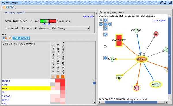
Gene Heatmap
New gene-level heatmaps provide clarity into which genes are up and down regulated in a particular pathway, upstream regulator, or downstream disease or function across conditions enabling rapid identification of significant genes or regulators across those conditions.
Find trends and similarities across analyses using new heat maps for Downstream Effects, Upstream regulators, and Causal Networks
Filter heat maps based on score (z-score or p-value, depending on which you selected to visualize) to eliminate less relevant heat map rows where no analysis meets the filter cutoff. The Upstream Regulator and Causal Network heat maps additionally enable filters on which type of upstream regulators (i.e. molecule types) appear in the heat map which allows a focus of the comparison on a particular kind of regulator, such as microRNAs, transcription factors, or chemicals.
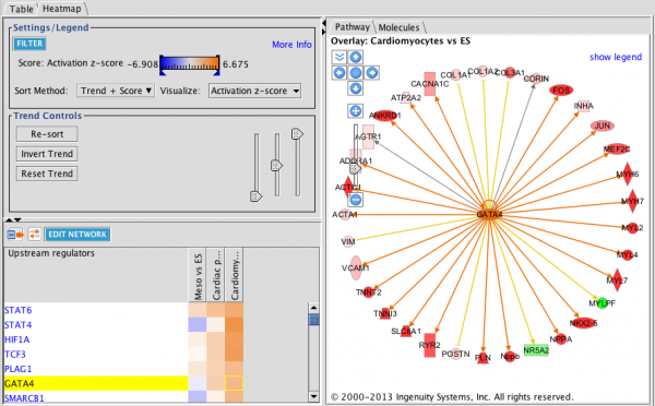
Upstream Regulator Heat Map: This heat map is filtered for Transcription Factors (Transcriptional Regulators plus Ligand-Dependent Nuclear Receptors) and sorted by increasing trend from left to right. The three analyses track mouse embryonic stem cells as they differentiate in vitro to cardiomyocytes. Orange squares indicate predicted increase in activity while blue squares indicate predicted decrease in activity. In this example, GATA4 is predicted to increase in activity as differentiation progresses. The circular network on the right shows the upstream regulator in the center with its targets colored by the expression results.
Click on any heat map square to visualize the relevant network of genes. In the case of Downstream Effects Analysis (i.e. predicted increases or decreases to Bio Functions and Tox Functions), the network shows the genes in the particular analysis that have a causal or correlative relationship with the disease or function and indicates how they might increase or decrease the disease or function.

Downstream Effects Heat Map: This heat map is clustered hierarchically on both axes (diseases & functions versus analyses, with heat map squares colored by z-score. The network shown on the right indicates how the function “hypoplasia of heart ventricle” is predicted to be decreased by virtue of the 6 genes in the cardiomyocyte dataset that are upregulated.
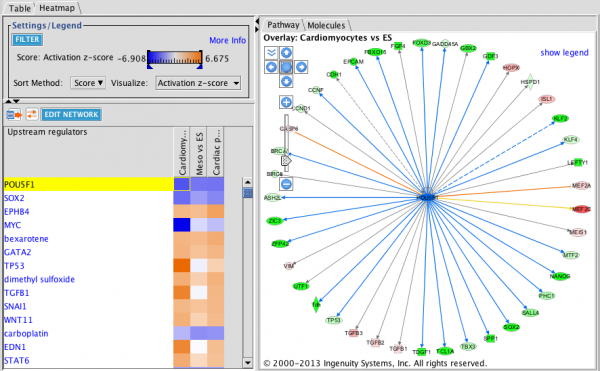
Upstream Regulator Heatmap: the network shows the genes downstream of the Upstream Regulator arranged radially around the regulator.
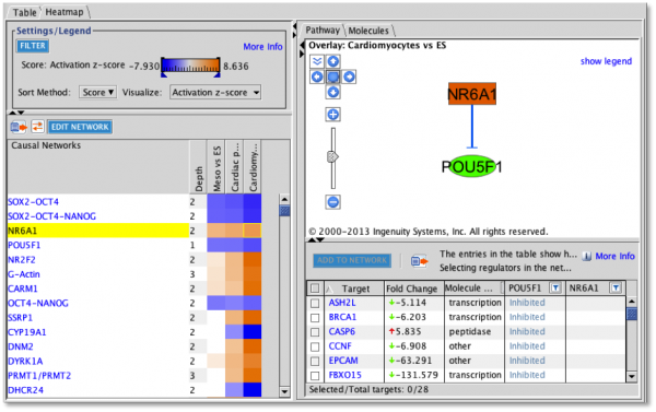
Causal Network Analysis Heatmap: the network shows the causal network with its master regulator at the top of the hierarchy and intermediate regulators arranged below it. The targets of the causal network can be added to the visualization from the table below the network.